Choosing the right image format is the first and most important step when it comes to image performance. We want our websites to load fast, but we also want our images to look good. Balancing these two concerns is the core of image performance.
Image formats are file types for digital graphics that have evolved over time to make use of new software and hardware technologies and faster networks. These days we have plenty of options to choose from, including file types for raster images, animations, vector graphics, and next-generation images.
In this article, we’ll look into the most important image formats for the web and help you decide when to use which image file type.
Why Do Image Formats Matter?
Finding the right format for your digital images is important because each image file type comes with its own feature set, has its advantages and disadvantages, and serves specific use cases. Using less effective formats for many of your images can increase page load times, make your website less visually attractive, and harm the overall user experience.
Image file formats vary in:
- Scalability:
- Raster, also known as bitmap, images (e.g. PNG, JPG, GIF) are made up of pixels, so they cannot be magnified without losing quality.
- Vector images (e.g. SVG) are made up of geometric shapes, so they scale without any quality loss.
- Compression method (lossy vs lossless compression) — see below in detail
- Level of browser support
- Other characteristics such as support for different color depths, transparency, animations, etc.
Choosing the best file type for an image is about finding the balance between visual quality and performance (defined by the size of the image file). Next-generation image formats (e.g. WebP and AVIF) aim to achieve smaller image sizes while providing advanced visual features.
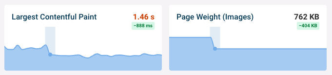
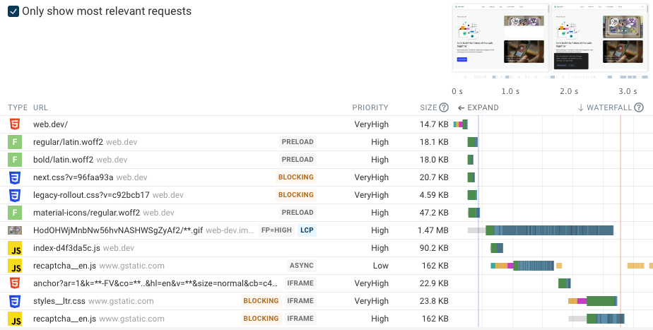
For example, at DebugBear, we were able to cut our hero image size from 171 KB to 94 KB and improve our Largest Contentful Paint (LCP) score from 2.4 to 1.5 seconds by switching from PNG to WebP format — see the drop in both LCP and total image weight on the screenshot below (however, some other developers had different results when testing next-gen images, as we’ll see later in this post):
Lossy vs Lossless Compression
Most raster image formats you can use on the web are compressed formats. They are reduced in size by a compression algorithm (also known as a codec), which removes non-essential and/or less important data from a file following pre-defined rules.
There are lossless and lossy data compression algorithms — next-generation images support both types.
Lossless Compression
Lossless compression algorithms only remove non-essential data (i.e. unnecessary metadata). As a result, they usually (but not always) generate larger-size files than lossy algorithms. However, there’s no loss of quality (this is why they’re called ‘lossless’) and the compressed image looks the same as the original one.
Some examples of lossless data compression algorithms are:
- RLE (Run-Length Encoding)
- Huffman coding
- LZW (Lempel-Ziv-Welch) compression used by GIF images
- DEFLATE used by PNG images
Note that as these are general-purpose algorithms — they are not exclusively for image compression. For example, Huffman coding is used for compressing HTTP/3 headers, and DEFLATE is the basis of GZIP compression as well.
Lossy Compression
Lossy compression algorithms remove both metadata and essential data (less critical visual information), therefore they can achieve a higher compression ratio. While smaller image sizes improve web performance, lossy image compression does come with quality loss — for instance, you can end up with pixelated images.
Some examples of lossy compression algorithms are:
- Fractal compression
- DFT (Discrete Fourier Transform)
- DCT (Discrete Cosine Transform) used by JPG images
Since this type of compression comes with information loss and quality degradation, lossy image formats include quality settings to allow the application or user to determine how much quality loss they are willing to tolerate in exchange for a higher compression ratio.
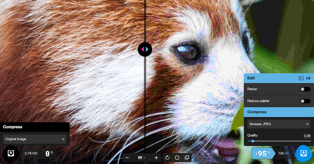
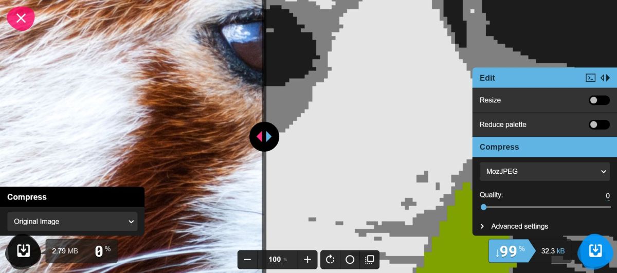
Higher-quality images usually (but not always) mean smaller file sizes. For example, when we set the quality ratio for this JPG image to 75% in the Squoosh app, we could reduce the file size by 69%:

With a quality ratio of 85%, the compressed file was just 48% smaller than the original one — while the compressed image is a little bit sharper now, there’s still not a huge difference in quality:

However, with a quality ratio of 95%, the compressed image is 8% larger than the original one — this is the ratio where lossy compression isn’t worth it anymore:
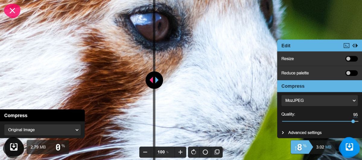
For reference, here’s what the image looks like with a quality ratio of 0% — the color palette is reduced to the most basic colors, and the figure on the image becomes unrecognizable:
The Best Image Formats for the Web
The following list includes the best file formats you can use for displaying images on web pages in production.
There are other image file types that are supported by web browsers as well, such as the ICO format frequently used for favicons or the uncompressed BMP format, however they are not recommended for web content as they have better alternatives.
GIF (Graphics Interchange Format)
The GIF format was first released in 1987 with the aim to compress large image files to make them download faster. While these days it’s best known for animated GIFs, it’s actually a still image format, and animated GIFs are flipbooks of multiple still GIF images.
As GIF was created in the era of the early web, it has fewer features than other image formats, however due to its relatively small size, it can help with performance optimization and still has a place in modern web development.
Key Features of GIF
- a lossless format for raster images
- uses the LZW compression algorithm
- 8-bit indexed palette (can display only 256 standard RGB colors on one image)
- supports basic, auto-playing animations
- supports one-level transparency (a pixel is either fully transparent or fully opaque)
- extensive browser support
Recommendations
- Use GIF for logos, grayscale photographs, and cartoon-style web graphics that are only made up of a few colors.
- Don’t use GIF for high-resolution photos and detailed images that include more than 256 colors.
- While animated GIFs are popular, they’re bad for web performance and accessibility, so consider replacing them with animations that can be stopped, e.g. short MP4 videos or animated SVGs.
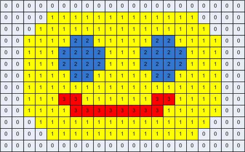 Image: The breakdown of a GIF file made up of four colors
Credit: CommandLineFanatic.com – Inside the GIF file format
PNG (Portable Graphics Format)
The PNG format was created in 1995 to provide a non-patented alternative to GIF, as the LZW algorithm used for compressing GIF files was patented at that time (the patent expired worldwide in 2004). PNG uses the non-patented DEFLATE algorithm which is a combination of LZW and Huffman coding. It offers more visual features than GIF, including semi-transparency via the alpha channel and a much broader color palette.
Key Features of PNG
- a lossless format for raster images
- uses both pre-compression and the DEFLATE compression algorithm
- 24-bit color depth, also known as true color (8 bits per channel on the red, green, and blue channels), which is equal to 16,777,216 (256x256x256) colors in the standard RGB color space
- supports transparency and semi-transparency via the 8-bit alpha channel
- good text readability due to the lossless compression
- extensive browser support
Recommendations
- Use PNG for non-photographic images, logos or graphics with transparent backgrounds, and illustrations that include text such as screenshots, marketing banners, charts, or infographics.
- Don’t use PNG for high-resolution photos as it will result in a huge file size.
- You can use PNG as a fallback for the lossless versions of next-generation images.
 Image: Transparent NASA logo in PNG format
Credit: PNGEgg
Image: Transparent NASA logo in PNG format
Credit: PNGEgg
JPG/JPEG (Joint Photographic Experts Group)
The JPEG standard was created in 1992 by the Joint Photographic Experts Group which wanted to come up with a good-looking but lightweight digital format for photographic images. They introduced the concept of lossy compression for images, which is based on the science of how humans see and removes high-frequency visual information such as hue and sharp transitions.
The JPG format is associated with six file extensions: .jpg, .jpeg, .jpe, .jif, .jfif, .jfi — JFIF stands for JPEG File Interchange Format. There’s no difference between them; they were created to support different platforms, but today.jpg is the standard extension.
Key Features of JPG
- a lossy format for raster images
- its compression method is based on the DCT (Discrete Cosine Transform) algorithm
- 24-bit RGB color depth (~16.77 million colors) like PNG
- allows applications to set the compression ratio
- comes with generational loss (the quality degrades with every modification to the image file)
- extensive browser support
- also has a lossless version called JPEG LS, but browsers and most image editing tools don’t support it
Recommendations
- Use JPG for photographic images and photo-realistic digital graphics that don’t include any text.
- Don’t use JPG for icons, line drawings, and text-heavy images because JPG images have poor readability due to the lossy compression.
- You can use JPG as a fallback for the lossy versions of next-generation images.
JPG/JPEG vs JPEG XL
JPG has some next-generation variations, including JPEG 2000, JPEG XR, and JPEG XL. The most advanced one is JPEG XL (it supersedes both JPEG 2000 and JPEG XR), but it’s still behind feature flags on all browsers — and the Google Chrome team have recently announced that they’ll remove support for it.
JPEG XL adds several advanced features to JPG images (e.g. animations, layers, overlays, alpha channels, depth maps, etc.), comes with better image quality, and supports both lossy and lossless compression. It’s also more advanced than both WebP and AVIF, the two next-gen image formats currently supported by web browsers.
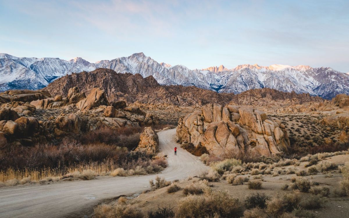 Image: An example of a high-resolution JPEG photo
Credit: Errin Casano, Pexels
Image: An example of a high-resolution JPEG photo
Credit: Errin Casano, Pexels
WebP (Web Picture)
The WebP format has been created by Google with the aim to replace GIF, PNG, and JPG with a more lightweight and flexible image format that has both a lossy and a lossless version. WebP was first announced on the Chromium blog in 2010, and its first stable version was released in 2018.
According to Google’s studies, lossless WebP compresses 23-42% better than PNG while lossy WebP compression generates 25-34% smaller image files than JPG. However, some independent test results suggest that WebP compression is not always worth it — for example, Jim Nielsen found that lossless WebP files can be larger than their PNG equivalent optimized with the ImageOptim API.
Key Features of WebP
- a next-generation image format for raster images
- supports both lossy and lossless compression
- for lossy compression, it uses the keyframe encoding of the VP8 video format
- for lossless compression, it uses the WebP Lossless Bitstream specification
- 24-bit RGB color depth (like PNG and JPG)
- supports transparency and semi-transparency via the 8-bit alpha channel
- supports animations (see some examples by Colin Bendell)
- all modern browsers support it (global support is currently at 97.4%)
Recommendations
- To reduce page weight, consider converting your JPG images to lossy WebP and PNG images to lossless WebP format.
- If you need to support Internet Explorer or other old browsers that don’t support WebP images, add the JPG or PNG version as a fallback.
- Run your own tests to see whether the additional complexity is worth the performance gain and whether you can achieve a similar result by optimizing your existing images.
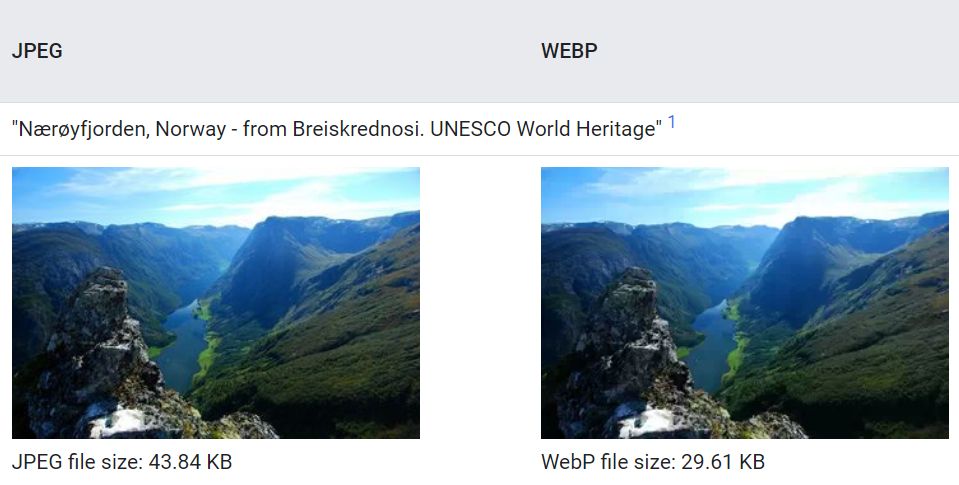 Image: JPEG vs WebP comparison
Credit: Google Developers, WebP Gallery
Image: JPEG vs WebP comparison
Credit: Google Developers, WebP Gallery
AVIF (AV1 Image File)
The AVIF image format was released in 2019 by AOMedia (Alliance for Open Media) with the aim to achieve a better compression quality than WebP. Both its lossy and lossless versions use the AV1 video codec for compression. AVIF comes with advanced visual features that currently no other production-ready image format offers, such as depth maps and overlays.
AVIF also supports three color depths: 24-bit (true color) which is equal to 8 bits/channel across the three RGB channels (red, green, blue), 30-bit (deep color) which is equal to 10 bits/channel, and 36-bit which is equal to 12 bits/channel. This makes it possible to use color spaces beyond sRGB (standard RGB) such as HDR (High Dynamic Range) and WCG (Wide Color Gamut).
While AVIF has been created to supersede WebP, performance tests have had some mixed results. The lossy version performs well on all tests (see some examples on Netflix Tech Blog and by Daniel Aleksandersen and Jake Archibald), however the lossless version is often outperformed by WebP and even PNG (see this article on AVIF.io and this discussion on GitHub).
Key Features of AVIF
- a next-generation image format for raster images
- supports both lossy and lossless compression
- uses the AV1 compression algorithm
- supports 24-bit, 30-bit, and 36-bit color depths
- supports animations, alpha-channel transparency, depths maps, and overlays
- patchy browsers support (global support is currently at 76.2%; IE and Edge don’t support it and Safari only has partial support)
Recommendations
- As AVIF’s lossy version almost always outperforms JPEG and WebP, especially at low fidelity, consider converting your JPEG and WebP photos to AVIF format, but add WebP and JPG (or just JPG) as fallback for non-supporting browsers — see a code example later in the article.
- Because of the poor test results of AVIF’s lossless version, don’t convert your PNG and lossless WebP images to AVIF, unless you want to use AVIF's visual features or your own performance tests show otherwise — instead, optimize your existing PNG images or convert them to WebP.
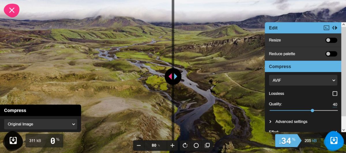 Image: Compressing JPG to lossy AVIF with the Squoosh app
SVG (Scalable Vector Graphics)
SVG is a vector image format that you can use on the web. It's been developed by W3C since 1999, and the first version was released in 2001. Each SVG graphic is composed of geometric shapes such as lines, curves, and polygons defined as vectors in a Cartesian coordinate system. As SVG images consist of mathematical formulas (instead of pixels), you can increase their size without any loss of quality.
Even though browsers and vector image editing tools display SVG files as images, SVG is actually a text file that can also be edited as code. SVG files are usually more lightweight than their PNG equivalent (except for highly complex illustrations). As SVG uses the XML markup, it has a syntax similar to HTML and can be added to HTML pages as inline code.
Key Features of SVG
- an XML-based vector image format
- retains quality at any size
- supports the 24-bit sRGB color space (like PNG, JPG, and WebP)
- supports animations and transparency
- can be styled with CSS and programmed in JavaScript
- wide browser support (Internet Explorer only has partial support)
Recommendations
- Use SVG for line graphics, text-heavy images, logos, icons, background patterns, and vector illustrations.
- Don’t use SVG for complicated graphics such as illustrations using hundreds of colors or artwork with fine details.
- To reduce the number of HTTP requests, consider adding less complex SVG images as inline code to your HTML page.
- If you need to support Internet Explorer, use PNG or GIF as a fallback.
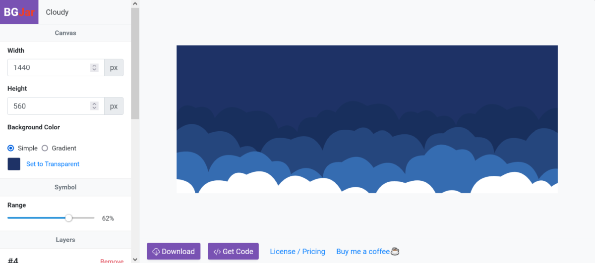 Image: A customizable SVG background in BGJar
What Image Format Should You Use?
Choosing the best image formats for your website depends on many things, including your content strategy, your stack (e.g. some content management systems such as WordPress need plugins to add next-gen images), the browsers you need to support, the devices your audience typically use, the characteristics of your images, and others.
However, here are some pointers to help you choose:
If you don’t want to add next-generation images yet but still want to find the best balance between performance and quality, use:
- JPG for photos and photo-realistic illustrations (you can optimize them with a tool such as MozJPEG)
- PNG for screenshots and complex non-photographic illustrations, or instead of SVG if you don’t want to use vector graphics
- SVG for icons, vector logos, illustrations with less complexity, text-heavy images, background patterns, and animations
- GIF for cartoon-style web graphics, grayscale photographs, and non-vector logos
If you are willing to use next-generation formats, start by replacing your JPG images with the lossy version of WebP or AVIF. While AVIF is less widely supported by browsers than WebP, its lossy algorithm has a better compression ratio and it offers more advanced features.
You can use the <picture> HTML element to add your images in both AVIF and WebP formats complete with a JPG fallback to let the user’s browser decide which file type to use:
<picture>
    <source srcset="image.avif" type="image/avif" />
    <source srcset="image.webp" type="image/webp" />
    <img src="image.jpg" alt="Image" width="1280" height="960" />
</picture>
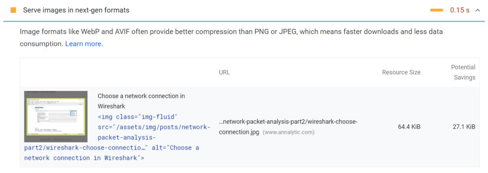
Replacing your JPG files with WebP or AVIF images can also improve your Lighthouse performance scores as it can help you get rid of the ‘Serve images in next-gen formats’ issue.
Depending on the possible performance gain, this can be either a warning (yellow) or an error (red):
As the lossless versions of WebP and AVIF have had some mixed test results, it’s not necessarily worth adding them, unless you want to use their other features, such as AVIF’s support for non-standard RGB color spaces. It can be a good alternative to optimize your PNG images with a tool such as Oxipng or ImageOptim or replace them with SVG wherever it’s possible to use vector graphics.
If you have an image-heavy website, it’s also a good idea to consider using an image CDN such as Cloudinary. These services automatically generate, select, and serve the most performant format and size for each image on your site.
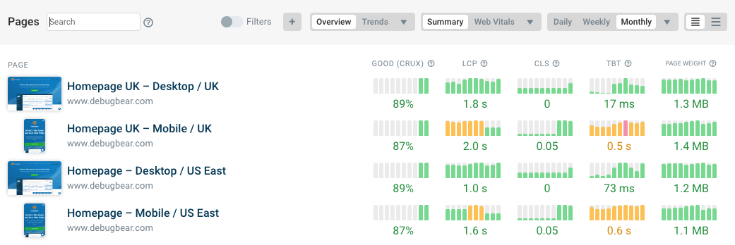
How to test if images are slowing down your website
You can use DebugBear's free website speed test to see how image downloads are impacting your performance and Core Web Vitals.
Next Steps
Finding the best image format is just the first step of image optimization. There are many other best practices you can follow to improve image performance on your website, such as lazy-loading images and prioritizing them with Priority Hints.
You can also compare the different formats with Squoosh or test how your images perform from different locations around the world using a synthetic performance monitoring tool such as DebugBear. To get more insight into your image performance, check out our interactive demo or sign up for a 14-day, no-credit-card free trial.