Want custom styles in your HTML select box instead of just text? Traditionally you've needed a JavaScript library for this.
However, the latest version of Chrome now supports native customizable select boxes and dropdowns. Find out how it works and why it's useful.
What are customizable select boxes?
Customizable selects are an HTML feature that allows you to create select boxes with custom styles and layout. For example, you can control text colors and styles, add images, or control how the selected element appears.
In contrast, standard system select boxes only support text content.
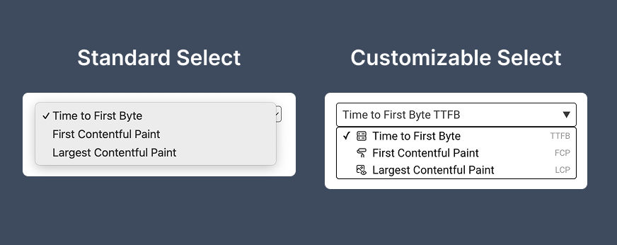
While the way that a standard select box appears depends on the operating system and browser that's rendering the page, customizable selects have consistent styles across different environments.
Why is native support for select customization useful?
Many websites already provide advanced custom selection interfaces, using JavaScript libraries like Select2, Chosen, or React Select.
However, these libraries come with multiple downsides:
- They don't work if visitors have JavaScript disabled, or are still waiting for the full JavaScript code to load.
- Loading additional libraries also increases overall page weight and can make websites load more slowly.
- Developers also have to select one of many libraries and check that it works well for their use case.
If browsers provide a more powerful native option for building select boxes that makes life easier for developers and is good for web performance.
Native components also provide better accessibility, as the functionality that's provided by the control is clear from the HTML elements.
How to create a customizable select
Customizable selects are built on top of the existing <select> functionality that browsers support already. To get started you just need to apply the appearance: base-select CSS property.
<style>
  select,
  select::picker(select) {
    appearance: base-select;
  }
</style>
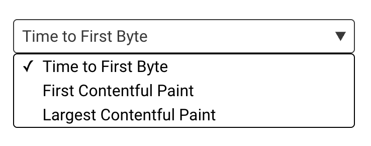
Here we're applying the custom styles to both the select box and the picker that displays the list of options.
Now, without doing any further work, the appearance of the select box changes like this:
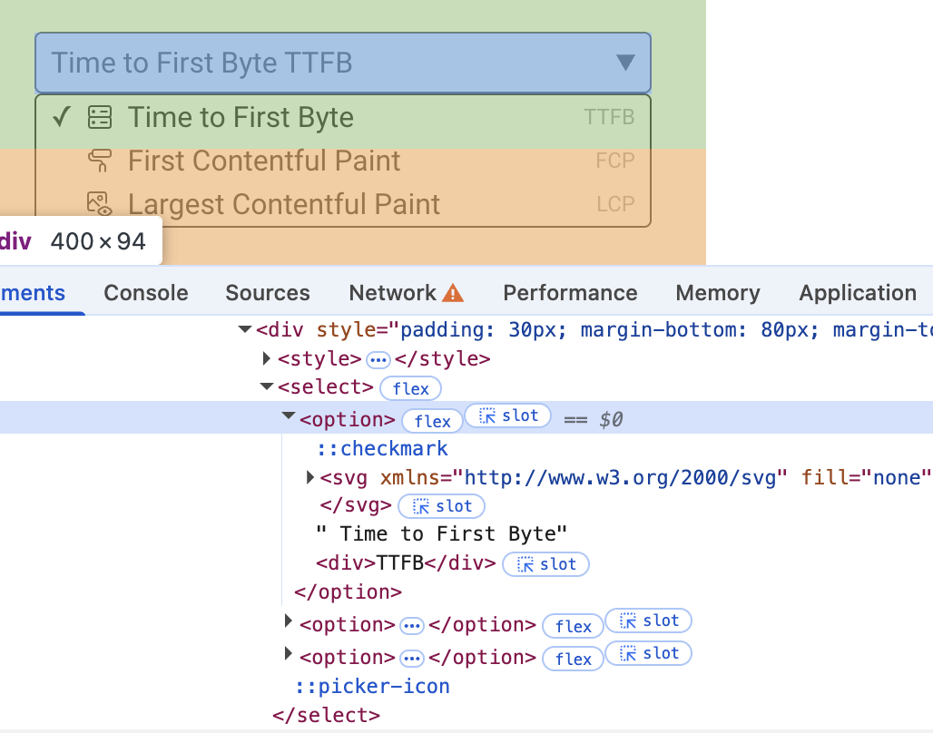
Once custom styles are enabled we can edit our <option> items to contain other HTML tags and style those elements as needed.
<select>
  <option>
    <svg ... /> Time to First Byte
    <div>TTFB</div>
  </option>
</select>
Show the selected value with selectedoption
So far we've styled the items in the picker, but the selected item was still text-based and used just the default styles.
To configure how the selected item appears we can add a <button> as the first child of the select box. While we can add different types of content here, a lot of the time you'll want to just re-use the styles and content from the <option> that's selected.
To do that, we can use the <selectedoption> tag:
<select>
  <button>
    <selectedcontent />
  </button>
  <option>...</option>
</select>
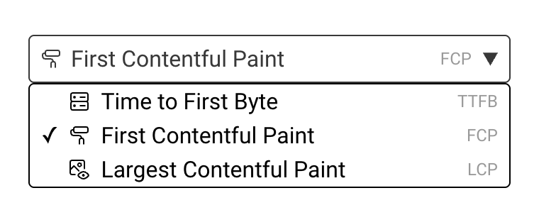
The browser now uses the content from that option as the select button:
How to style the selected element
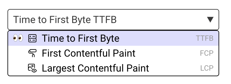
By default, customizable selects show a tick mark next to the selected elements. However, you can customize or hide that by styling the ::checkmark pseudo-element.
You can also apply styles directly to the selected option with the :checked pseudo-class:
<style>
  select ::checkmark {
    content: "👀";
  }
  select option:checked {
    background: #ddddff;
  }
</style>
Now the selected item looks like this:
Are customizable selects searchable?
The new select box does not include any features to natively add search functionality to the UI component. It's also not possible to embed <input> elements into the select button.
So for now you'll have to rely on JavaScript and custom select components to provide search functionality.
What is the browser support for customizable selects?
Customizable selects are a new feature. Currently they only work in the latest version of Chrome.
Browsers that don't support the custom content may still be able to fall back to just showing the text. For example, if we load the previous select box in Firefox it looks like this.

While this is usable, we may want to adjust the text somewhat. For example we could wrap the acronym in brackets to better differentiate it from the text that normally appears on the left.
Monitor Page Speed & Core Web Vitals
DebugBear monitoring includes:
- In-depth Page Speed Reports
- Automated Recommendations
- Real User Analytics Data
