Properly size images is a Lighthouse performance audit that detects unnecessarily large images on a website and measures how much longer it will take for the page to load. If this additional wait time passes a certain threshold, the Properly size images audit will fail.
But, there's no reason to worry.
In this post, we'll see how to properly size images to pass the audit, make your website faster, and improve your Core Web Vitals.
What Is a Properly Sized Image?
An image is properly sized when its intrinsic and rendered size are close to each other (or, ideally, identical).
The intrinsic size is the natural width and height of an image in pixels, as the image file is saved to the disk.
The rendered size, on the other hand, is the display width and height of an image, also in pixels — these are the dimensions in which the browser will render the image to the screen.
You can see the intrinsic and rendered size of an image by hovering your cursor above the <img> element in the Elements tab in Chrome DevTools.
In the screenshot below, you can see an image with its sizing information from Expedia's homepage:
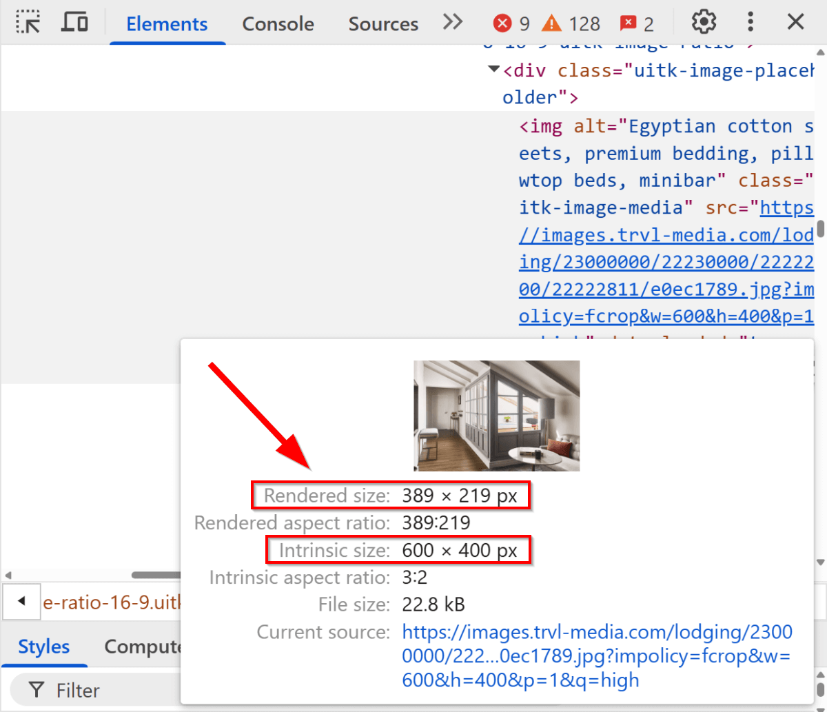
Since the rendered size of an image depends on many factors — such as the viewport size, device pixel ratio (DPR), available space, and layout rules defined in the CSS — images are often displayed much smaller than their natural dimensions. When this happens, it creates unnecessary page weight and wastes users' bandwidth.
An image is oversized when its intrinsic size is significantly larger than its rendered size (we'll look into the thresholds below).
While oversized images hurt web performance, including First Contentful Paint (FCP) and Largest Contentful Paint (LCP), undersized images (which are rendered in larger dimensions than their intrinsic size) may hurt aesthetics and design, as they typically appear pixelated or blurry on the screen.
How to Interpret the Properly Size Images Audit in Lighthouse?
In the screenshot below, you can see the Properly size images audit for Expedia's homepage on desktop (you can run a Lighthouse report from the Lighthouse tab in Chrome DevTools):
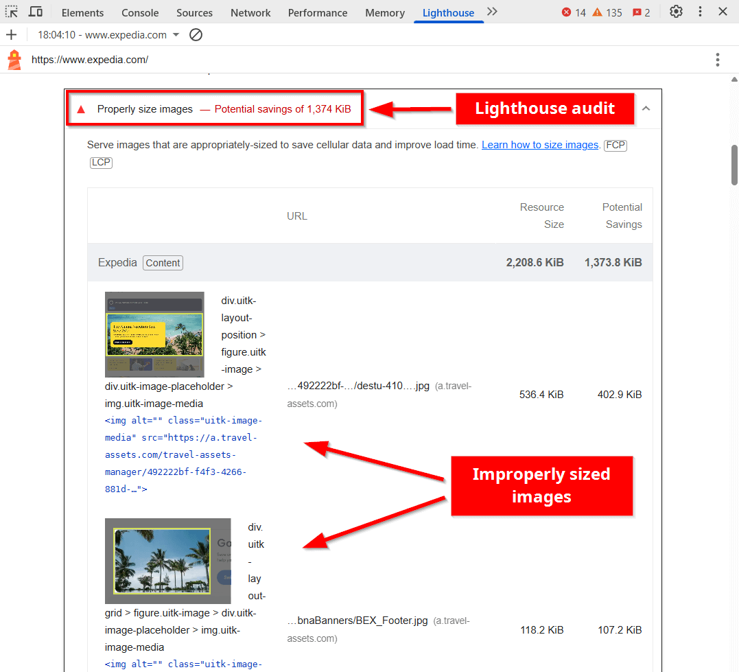
As you can see above, the audit shows a list of oversized images on the page, along with their resource size and potential savings.
Interpreting the Properly size images audit can be more complex than other Lighthouse performance audits. While it shows the potential savings for each image in kilobytes (i.e., in weight metrics), the passing and failing thresholds are based on estimated time savings in milliseconds (i.e., time metrics).
This approach, however, makes the audit more meaningful for real user experience, as it focuses on how much faster the page would load if all the images were properly sized, rather than just assessing the weight savings, which can translate to different page load times under different conditions (e.g., network conditions).
Passing and Failing Thresholds
As I mentioned above, Properly size images has two types of thresholds:
- Weight-based thresholds for individual images to decide which ones to flag
- Time-based thresholds for the total extra load time added by all flagged images on the page
First, Lighthouse evaluates each image on the page according to the following rules:
- Standard images:
- These are the
<img>elements that don't use a responsive image syntax. - Any standard image with more than 4KB of waste* gets flagged.
- These are the
- Responsive images:
- These are the
<img>elements that use a responsive image syntax (either thesrcsetattribute or the<picture>element). - Any responsive image with more than 12KB of waste gets flagged.
- These are the
Lighthouse quantifies image waste in two steps:
- It calculates the percentage of the original image's pixels that aren't being used when displayed on the page.
- It multiplies this unused pixel ratio by the download size of the image file to determine the waste in kilobytes.
As you can see above, Lighthouse rewards the effort of implementing responsive images, which is the primary way to properly size images (see below, in the first best practice).
Once Lighthouse gets the list of oversized images, it calculates the estimated loading time of all the flagged images based on characteristics such as network conditions, impact on Largest Contentful Paint (i.e., images that are LCP candidates have greater influence on the final score), the timing of image loading in the page lifecycle (e.g., images loaded early in the critical rendering path vs. images loaded after user interaction or below the fold), etc.
The time-based thresholds for the combined impact of oversized images on the page are:
- Green (pass): Total potential time savings are lower than 150ms (milliseconds).
- Yellow (warning): Total potential time savings are between 150ms and 935ms.
- Red (fail): Total potential time savings are higher than 935ms.
Exceptions to the Audit
There are four types of images the Properly size images audit skips:
- SVG images – As SVG (Scalable Vector Graphics) is a vector image format, its intrinsic size doesn't affect the file weight. This is determined by the complexity of the graphics, which is why SVGs are omitted from the Properly size images audit.
- CSS background images – Since dimension-based responsiveness for background images** can only be implemented using media queries, it's not worth it in many cases due to the added complexity. Plus, it's hard to tell whether a background image is a spritesheet, which is typically reused multiple times on the page and is considered a performance-friendly solution for providing icons or other smaller images on HTTP/1.1 connections. For these reasons, the Lighthouse dev team decided to exclude CSS background images from this audit.
- Images with missing information – If Lighthouse cannot determine an image's natural dimensions or access its network information, it will skip it, since it's impossible to estimate the waste. This can happen due to CORS restrictions, browser caching, or images that didn't load during the audit.
- Images that pass elsewhere on the page – If an image file appears multiple times on the page and passes the audit in at least one location, Lighthouse won't flag it all, even if it's oversized in other places on the page (e.g., when the same image file is used both as a large hero image and as a small thumbnail).
There are three types of responsiveness for both HTML images and CSS background images:
- Dimension-based (a.k.a. width-based) responsive images, which provide alternative image sources based on the width of the layout and viewport.
- Resolution-based responsive images, which provide alternative image sources based on the device pixel ratio (DPR).
- Type-based responsive images, which provide alternative image sources in different file formats (e.g., PNG, JPEG, WebP, AVIF, etc.).
To address the Properly size images audit, you need to implement dimension-based responsive images (see in the next section).
5 Best Practices to Properly Size Images
Before getting into the practice of how to serve properly sized images, let's see two techniques that won't help fix improperly sized images:
- Minification – While image files can (and should) be minified, minification itself doesn't address mismatches between the intrinsic and rendered sizes of an image. It doesn't reduce the dimensions of the image, just makes the file weigh less by removing unnecessary metadata or non-critical visual information.
- Next-generation image formats – Serving your images in next-gen formats, such as WebP or AVIF, won't change their dimensions either. These formats use more efficient compression algorithms than older image file types such as JPEG, but the intrinsic size of an image remains the same after conversion.
However, there are still some effective image performance optimization techniques you can use to improve your image delivery.
Here are five best practices that can help you properly size images:
1. Use Width-Based Responsive Images
The number one way to properly size images on your website is to use responsive images. When implementing responsive images, you provide alternative image files for one <img> location so that the browser can choose the best one to respond to the current conditions.
As I mentioned above, images can be responsive in different ways. To ensure your images are properly sized, you'll need to implement width-based responsive images in one of the following two ways:
- When the aspect ratios of the image sources are equal and they're only different in size, you need to use the
srcsetandsizesattributes together with w-descriptors (i.e., width descriptors) within the<img>element. - When the aspect ratios of the image sources are different and they respond to different art directions (e.g., you want to show a detailed landscape on large screens and a cropped close-up on mobile), you need to use the
srcsetandmediaattributes within the<source>elements of a<picture>tag.
The two code examples below are from our Ultimate Guide To Responsive Images On The Web where you can read everything you need to know about the various types of responsive images.
Responsive Images with the Same Aspect Ratio
The code example below provides the resized versions of the same image for different viewport sizes:
<img
  src="images/wdesc/lake-lg.jpg"
  srcset="
    images/wdesc/lake-sm.jpg  300w,
    images/wdesc/lake-md.jpg  600w,
    images/wdesc/lake-lg.jpg  900w,
    images/wdesc/lake-xl.jpg 1200w
  "
  sizes="60vw"
  alt="Lake"
  style="aspect-ratio: 3 / 2;"
/>
The responsive image syntax above defines:
- the default image in the
srcattribute - the alternative image sources in the
srcsetattribute with w-descriptors that specify the width of each image source (i.e., 300w means an image width of 300px, 600w means an image width of 600px, etc.) - the layout width in the
sizesattribute (here, it's 60% of the viewport width) - the aspect ratio of the image in the
styleattribute, which can help prevent unexpected layout shifts (you can't use thewidthandheightattributes along with w-descriptors and thesizesattribute as they would override them)
Using the srcset and sizes attributes along with the aspect ratio, the browser selects the optimal image source from the available alternatives to display the most appropriately sized image on the screen.
Responsive Images with Different Aspect Ratios
The code example below provides differently sized alternative image sources to support various art directions for three viewport sizes:
<picture>
  <source
    srcset="images/art-direction/lake-with-mountains.jpg"
    media="(min-width: 1280px)"
    width="1200"
    height="800"
  />
  <source
    srcset="images/art-direction/lake-without-mountains.jpg"
    media="(min-width: 640px) and (max-width: 1279px)"
    width="900"
    height="600"
  />
  <img
    src="images/art-direction/only-a-boat.jpg"
    alt="Lake"
    width="450"
    height="800"
  />
</picture>
The responsive image syntax above defines three image alternatives within the <picture> element:
- the default image in the
<img>element, along with thealt,width, andheightattributes - two alternative image sources in the
<source>elements, along with:- the
srcsetattributes for the paths of the image files - the
mediaattributes for the viewport width where the image should be used - the
widthandheightattributes for the intrinsic dimension of the alternative image source
- the
Here, the browser doesn't run a selection algorithm like in the previous case but uses the first <source> element with a media attribute that matches the current viewport width.
2. Connect to an Image CDN
As implementing responsive images on a larger website requires significant time investment and it's easy to make mistakes with the syntax or file uploads, you may want to automate the process to serve properly sized images to your visitors more efficiently.
One way to automate responsive image generation is using an image CDN (Content Delivery Network), which:
- delivers your images from a globally distributed network of servers so they load faster for each visitor
- resizes the images on the fly
- prepares the optimized source files
- inserts the responsive image syntax into the HTML
Some examples of image CDNs are Cloudinary, Imgix, Cloudimage, and ImageKit, all of which come with a free plan for a limited number of images.
3. Use a Platform-Specific Plugin or Component
If your website runs on a content management system (such as WordPress or Joomla) or your app is built on a framework (such as React.js, Next.js, Vue.js, etc.), check how it handles responsive images, as most of them have some kind of premade solution.
The available options depend on the platform, can be first-party or third-party solutions (e.g., plugins or components), and may allow for different levels of customization and automation.
Some platforms, such as WordPress, automatically resize images to a couple of default dimensions and add the responsive image syntax to the HTML, which can be sufficient for a less image-heavy site.
4. Replace Raster Images with SVGs
Using SVGs rather than raster images (e.g., JPEG, PNG, WebP, AVIF, etc.) allows you to serve perfectly sized images regardless of their display size.
Since the file size of a vector graphic depends on the complexity of the illustration instead of its dimensions, you don't need to worry about sizing when it comes to SVGs. This is also why the Properly size images Lighthouse audit completely skips the SVG format.
While SVGs are not recommended for photos, complex illustrations, or detailed artworks, they are ideal for many common web elements, including logos, icons, patterns, vector illustrations, line graphics, text-heavy images, etc.
5. Analyze Your Oversized Images
While Lighthouse gives you some insight into your improperly sized images, the data you get is limited and it doesn't always capture all oversized images on the page. To get more nuanced information, use a web performance analysis tool that runs on the Lighthouse API.
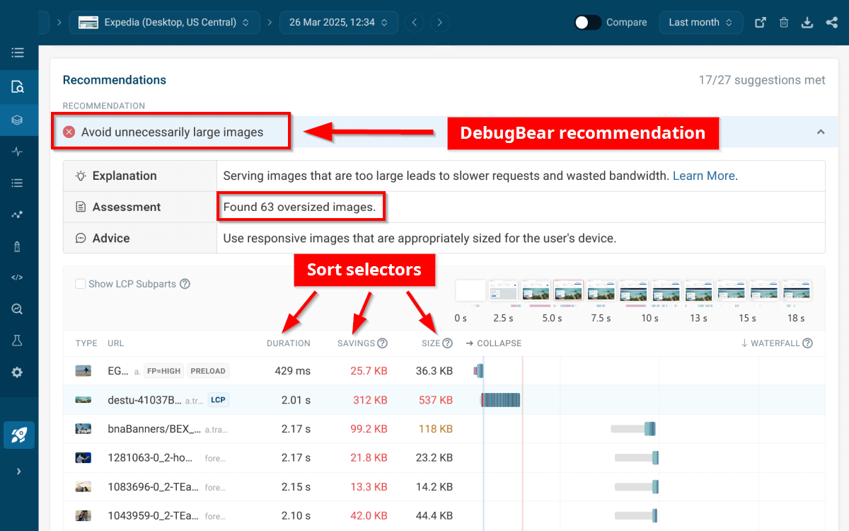
DebugBear, for example, shows advanced web performance recommendations in addition to the default Lighthouse audits. One is the Avoid unnecessarily large images recommendation, which provides the full list of oversized images on the page captured using the formula of Lighthouse's Properly size images audit.
It allows you to sort the images by various criteria (e.g., you can see which one has the biggest performance impact so you can fix it first), view the request waterfall chart for each image, get an aggregated assessment, and more (you can get similar recommendations for your own pages by running a free DebugBear website speed test):
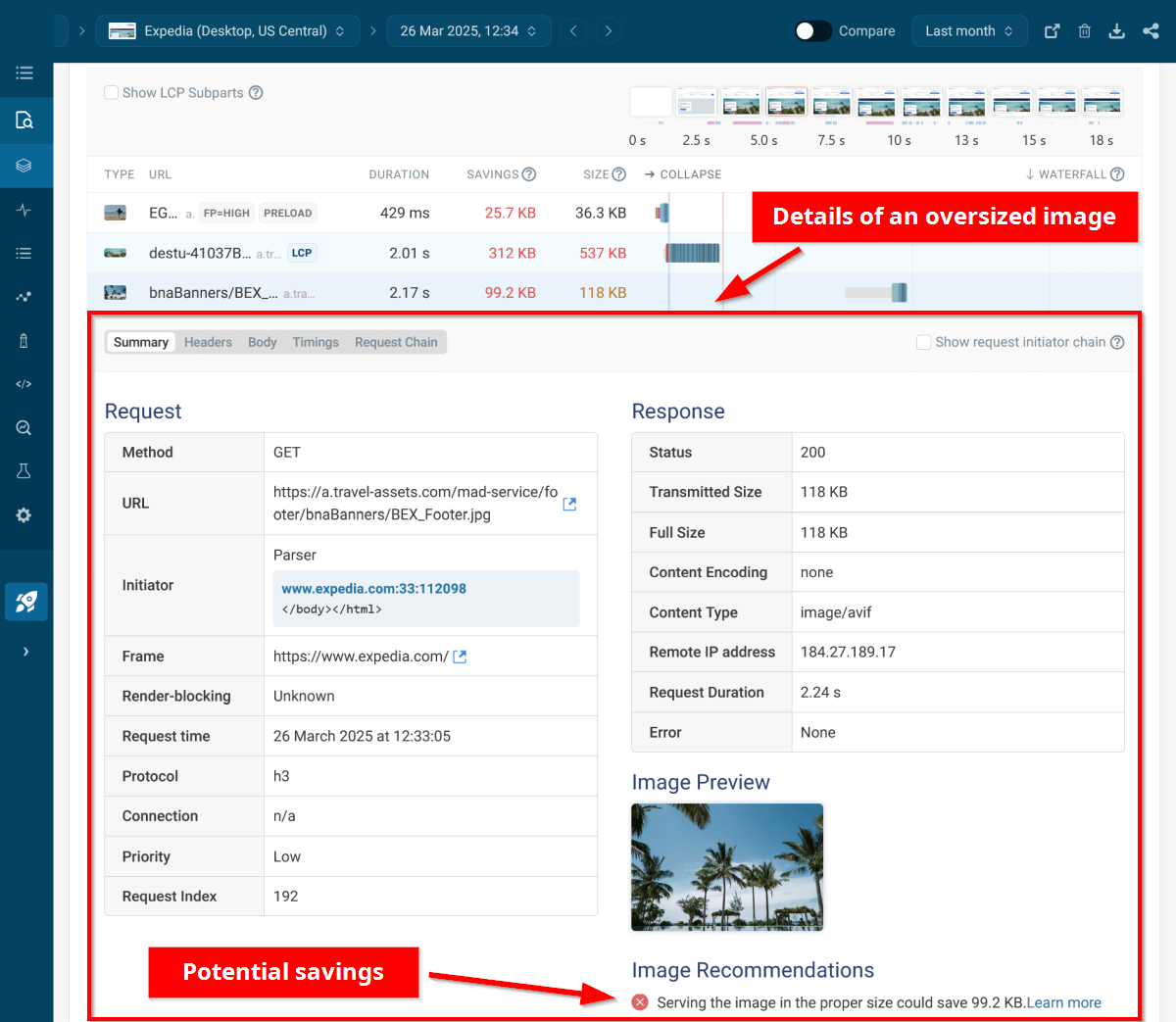
By expanding an image, you can see even more details, such as the request method, mime type, priority, etc., along with tailored image recommendations:
Monitor Image Weight on Your Key Pages
You can go beyond running one-off web performance tests by setting up continuous monitoring on your key pages to get alerted about your emerging issues as they happen. This way, you can avoid gradual regression of page speed and prevent failing Lighthouse audits, such as Properly size images.
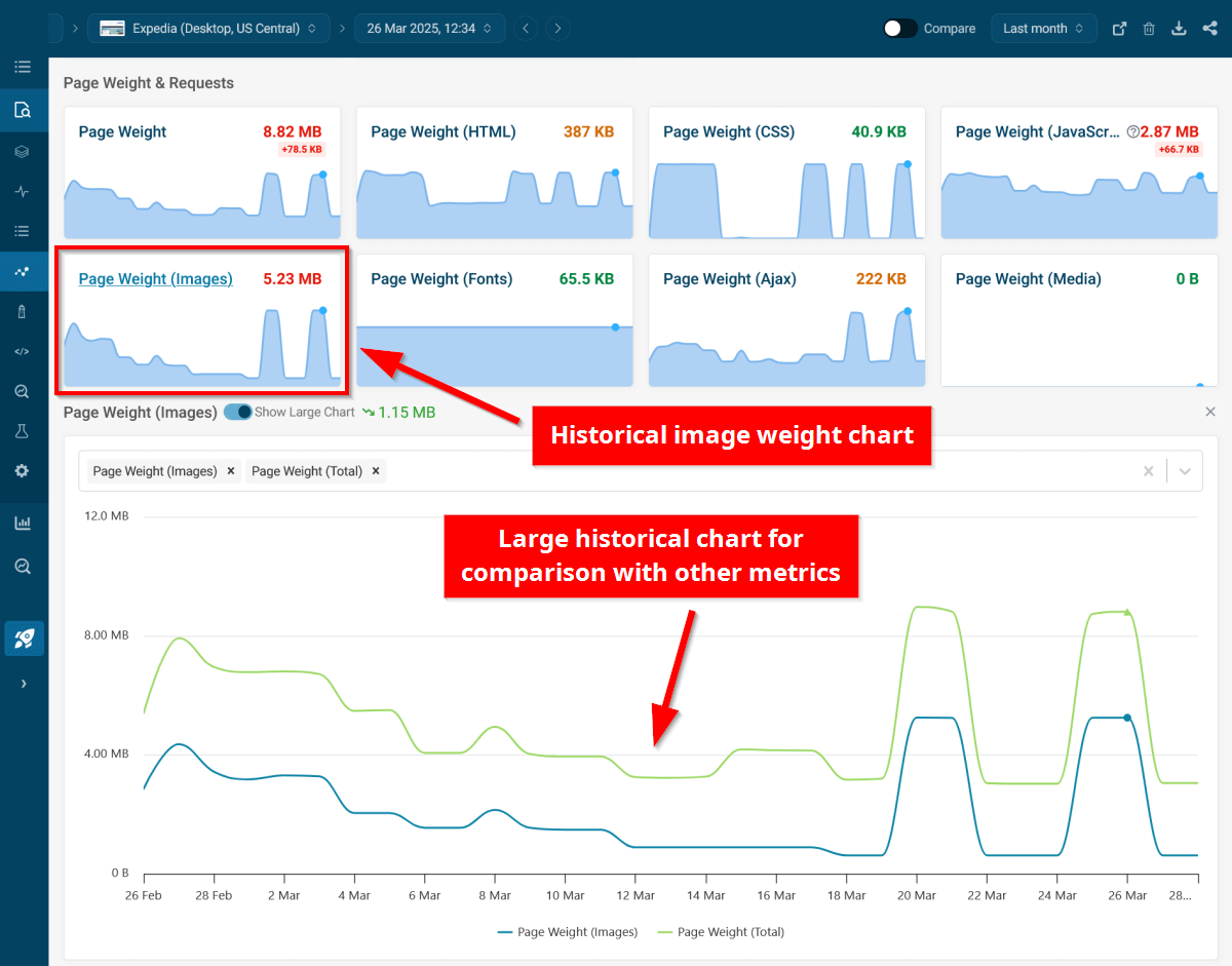
DebugBear's synthetic monitoring feature allows you to track changes in image weight over different testing periods (e.g., hourly, daily, weekly, monthly, etc.) and compare it with other performance metrics.
For example, the screenshot below shows the image weight and total page weight on Expedia's desktop homepage over the last month:
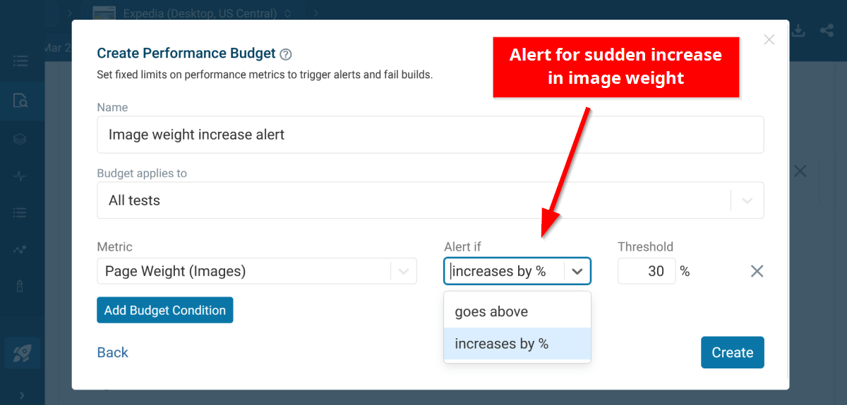
You can also set up performance budgets, which automatically alert you when the image weight (or any other metric) increases by a preset percentage or goes above a certain threshold:
With DebugBear, you don't have to bear with oversized images or other performance issues. Give it a try by signing up for our free 14-day trial, which gives you access to the full performance monitoring functionality.
Monitor Page Speed & Core Web Vitals
DebugBear monitoring includes:
- In-depth Page Speed Reports
- Automated Recommendations
- Real User Analytics Data
