On October 1, 2024, ConvertKit launched its bold new brand identity and Kit.com website, marking the finale of its four-month-long Rebranding in Public journey. While the visual design is stunning, we were curious about how the renewed brand measures up for web performance, an essential yet frequently overlooked aspect of user experience.
In Kit's launch video, Senior Software Engineer Mark Miller described the rebranding process as an opportunity for spring cleaning their code base. So we've spent the past few weeks carefully testing their revamped web presence to see exactly what this cleanup achieved in terms of Web Vitals and other web performance signals.
Want to know more about ConvertKit's $360,000 redesign process? Check out their launch video below. Curious about our web performance findings? Keep on reading.
As per the new Kit.com homepage, Kit is an "email-first operating system for creators". It provides an extensive landing page, course, and email building platform and a community network that allows its users to connect with their audience and each other and monetize their content.
Our Methodology
Setting up a reliable methodology to test the new Kit brand for web performance wasn't easy, as it has an extensive web presence, including the main Kit.com website with a blog, creator stories, and feature pages; a separate help website; the Kit University; the Creator Network; the Kit app; and others.
Synthetic Tests
To simulate Kit's diverse user base, we ran daily synthetic tests for a few weeks on both desktop and mobile devices across DebugBear's global network, using our test locations in Australia, Brazil, Finland, India, Poland, Taiwan, the United Kingdom, and the United States.
We tested a variety of pages, including the home page, the blog archive page, an individual blog post, a features page, a creator story, a help article, and the Creator Network home page. Each lab test was run three times, with the median value recorded, to get accurate data that reflects real-world variations.
CrUX Report
To complement synthetic testing, we also analyzed the Chrome User Experience (CrUX) Report, which includes aggregated Web Vitals scores from approximately 19 million domains. The CrUX Report is where the Core Web Vitals values used in Google's search engine algorithm come from, so it's important for SEO.
The CrUX metrics we used in our analysis apply to the kit.com origin domain and include all of its pages that have measurable traffic. However, it excludes pages hosted on Kit's subdomains, such as app.kit.com. We examined daily metrics beginning from the launch date of October 1, 2024.
Things We Missed
Despite our best efforts, we missed some performance data, mainly because we couldn't access pages behind a login (however, the CrUX report may include some of these pages). To get this data, we'd need real user monitoring, which we can't set up on someone else's domain.
This means we can't share performance insights about the Kit app, the Kit University, and other gated content. Still, we worked with what we had access to and tried to make the most of it.
The Success Story
The Kit rebranding is largely a success story for web performance. The tested pages consistently performed well for the key speed and user experience metrics, thanks to a clean and well-thought-out code base.
All-Green Core Web Vitals Worldwide
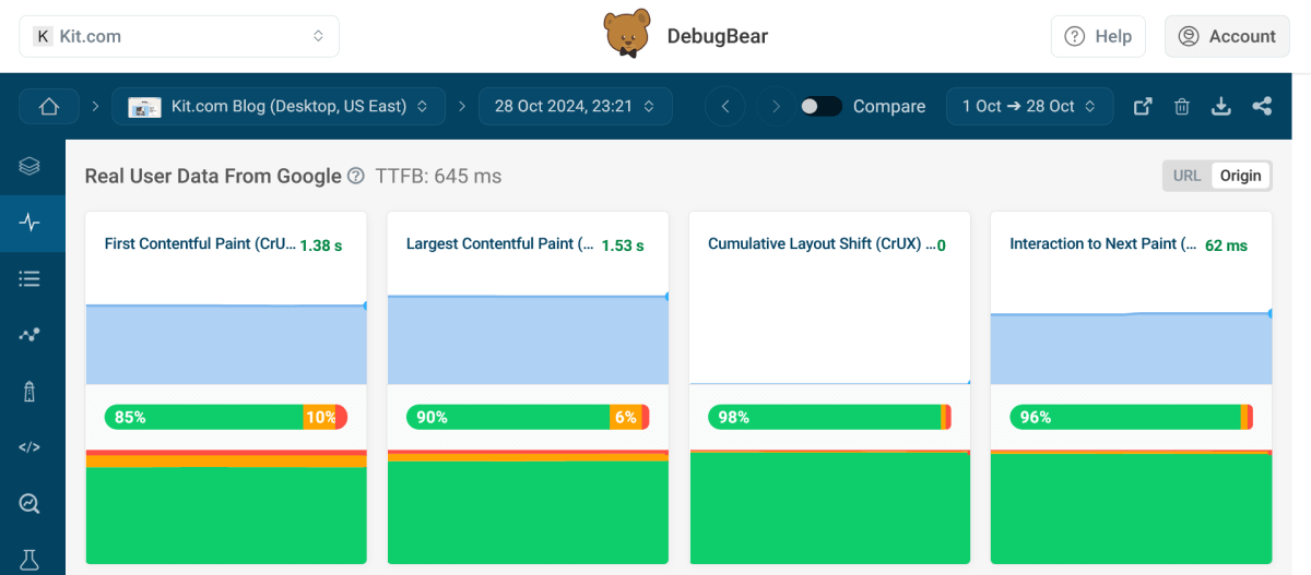
Most importantly, the Kit.com origin domain passed all three Core Web Vitals on both desktop and mobile in the CrUX Report, indicating overall good website health worldwide.
The desktop results were solid during our testing period, with 90% of all page visits receiving a green score for Largest Contentful Paint (LCP), 98% for Cumulative Layout Shift (CLS), and 96% for Interaction to Next Paint (INP) — all well above the 75th percentile threshold that Google considers a good result and prioritizes domains that achieve it in its SEO rankings:
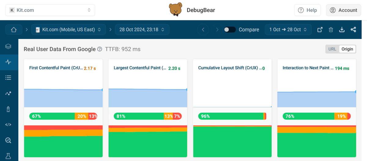
Core Web Vitals were somewhat lower on mobile, as shown by the data pulled from the mobile CrUX Report, with 81% of all page visits receiving a green score for LCP, 96% for CLS, and 76% for INP during the testing period. However, web pages typically perform worse on mobile than on desktop for Core Web Vitals, so these results are not surprising.
The only potentially concerning metric is Interaction to Next Paint, which is just one percentage point above the 75th percentile threshold. As testing real-world user interactions requires access to detailed real user data, it's hard to tell how mobile INP could be improved without setting up real user monitoring on the domain.
Kit's mobile Core Web Vitals still qualified as officially good during our testing period:
While DebugBear runs on the Lighthouse API and shows the official Lighthouse audits in the app, we also have our own recommendations that summarize or complement them.
Overall, DebugBear shows data from three places:
- Web Vitals measured by Lighthouse during the synthetic tests you can configure for various parameters.
- Web Vitals from the CrUX Report.
- Web Vitals measured on your real users by our RUM script that also uses Lighthouse to make the calculations.
The goal of this setup is to enable you to compare data from different sources to get a more comprehensive view of your web performance profile.
A Clear Critical Rendering Path
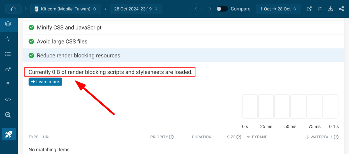
We were positively surprised to find zero render blocking resources across all the tested pages.
While this happens because all CSS files used on the page are preloaded, which makes them non-render-blocking resources, it's still nice to see a clear critical rendering path:
All-Green Resource Hint Recommendations
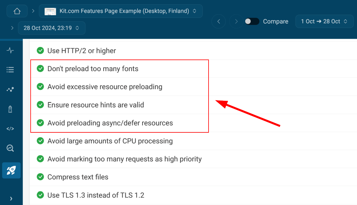
DebugBear has four recommendations for resource hints, and Kit.com passed all of them across the tested pages.
DebugBear's resource hint recommendations are as follows:
- Don't preload too many fonts.
- Avoid excessive resource preloading.
- Ensure resource hints are valid.
- Avoid preloading async/defer resources.
This indicates a well-implemented and reasonable resource hint strategy that helps the browser render pages faster and more smoothly (instead of confusing or overwhelming it, which we see on many websites):
Well-Optimized Web Fonts
The last chapter of Kit's web performance success story is about fonts. We were happy to find that the tested pages comply with most of our font performance recommendations.
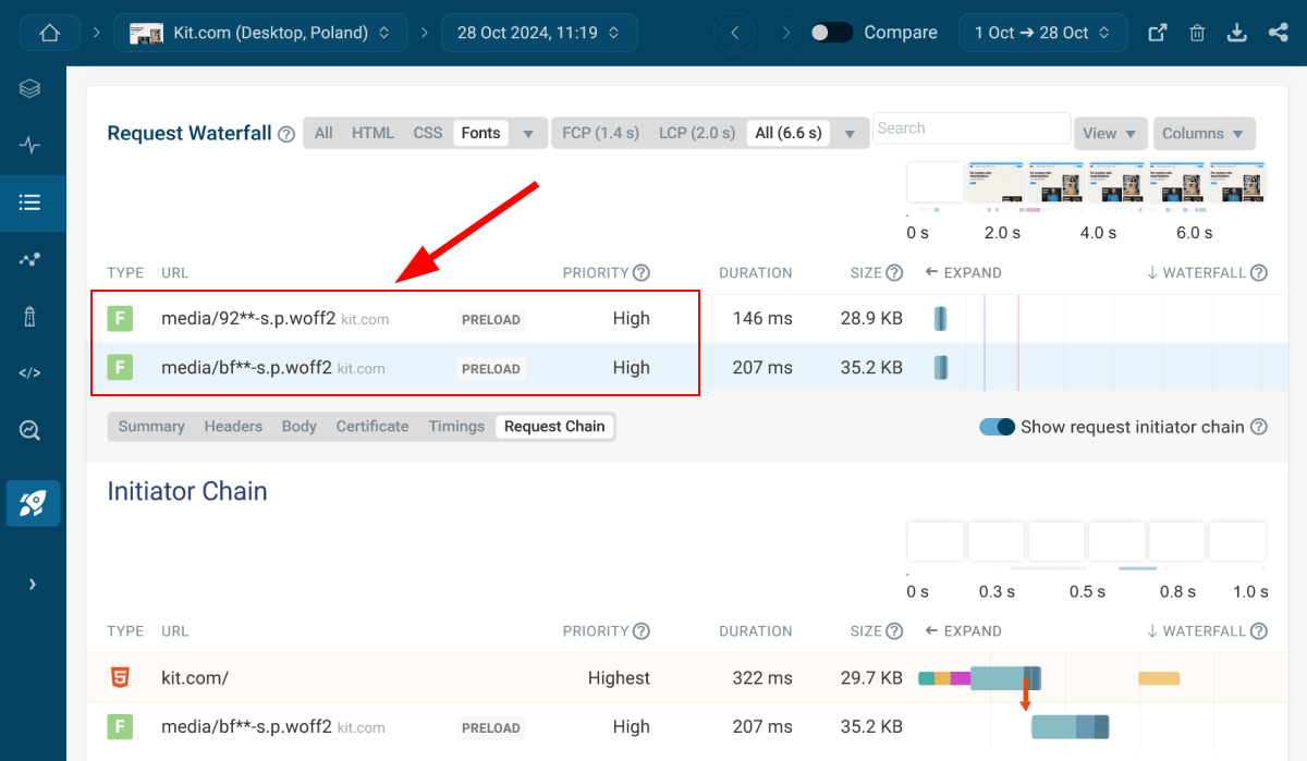
The tested pages only load two web fonts: the custom-made and beautifully designed Kit Sans typeface for headings and Libre Franklin, a Google Font they serve from their own domain.
The filtered request waterfall chart below shows that the font files are compressed to the performant WOFF2 format and preloaded with high priority:
The Glitches
Even though Kit's rebranding is largely a web performance success story, it still has a bit of shadow, like everything. To avoid getting too carried away, let's take a look at the few glitches we found during our testing.
Unnecessarily Large Images on Some Browsers
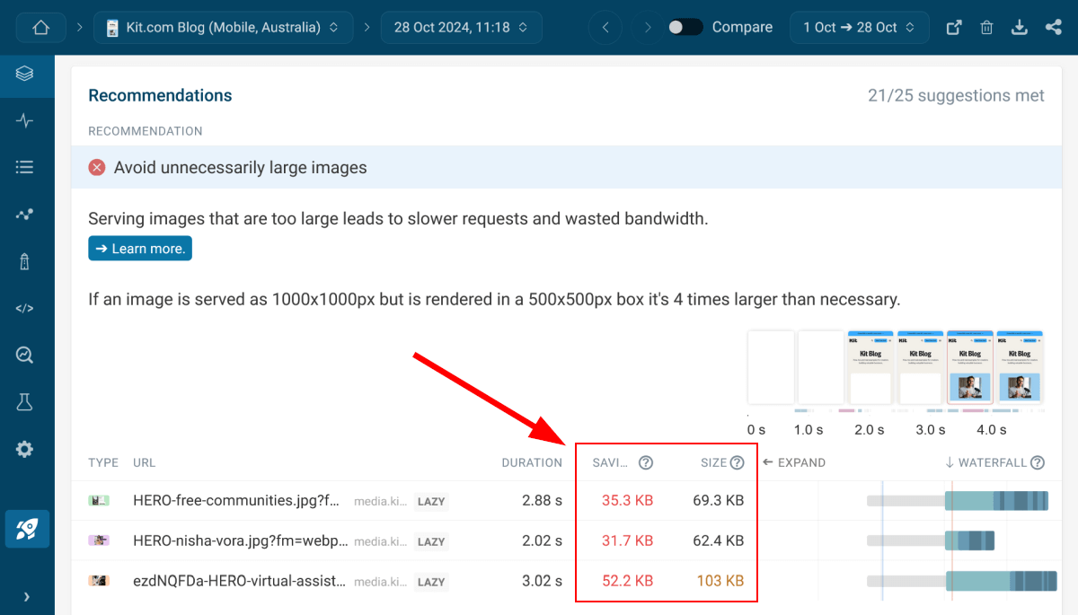
Some of the tested pages triggered DebugBear's Avoid unnecessarily large images warning.
Unnecessarily large images are a web performance issue that increases the page weight unnecessarily and harms most performance metrics. It usually stems from either not using responsive images at all or a conflict within the responsive image syntax, which browsers can't interpret correctly. Here, the second case was happening.
When examining the source code, we noticed that some images were using a super long value for the srcset attribute, with as many as 12 width descriptors. This syntax appears to be auto-generated, possibly produced by the CDN (Content Delivery Network) the page serves the images from.
Some browsers, especially on mobile devices, are not able to interpret such a complex syntax correctly and download the image files set as the default (which, in this case, were the largest ones). As the screenshot below shows, the potential savings could be significant (around 50% for each image):
TTFB Is Sometimes Too Long, Especially on Mobile
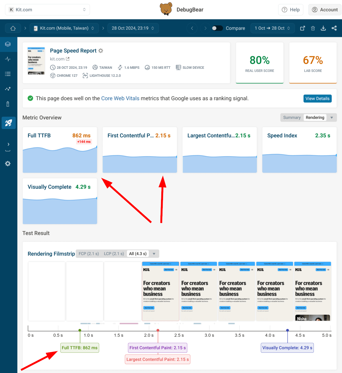
Time To First Byte (TTFB) sometimes stayed below the passing threshold (800 milliseconds), but not to a serious extent. While this metric is not part of Core Web Vitals, it constitutes the first phase of First Contentful Paint (FCP) and Largest Contentful Paint (LCP) — the latter directly impacting search engine rankings.
Kit.com runs on the Next.js framework that uses server-side rendering (SSR), which is a web performance optimization technique that frequently leads to higher TTFB values.
However, while server-side rendering typically increases TTFB (which is the first phase of LCP), it often reduces the subsequent phases of LCP.
TTFB becomes longer because the server needs more time to render the HTML page, but LCP can still improve as a result of SSR because the browser only needs to hydrate the pre-rendered page, which takes less time (and LCP can happen even before the hydration starts, as the metric only evaluates static content elements).
Overall, we're not sure whether it's possible to reduce TTFB on Kit.com since SSR inherently takes some time. However, optimizing server response times is still something that may be worth focusing on, e.g. by implementing full-page caching on the server (it's unclear if Kit does this, as we can't check server-side code):
LCP Images Load with Low Priority
Prioritizing LCP images is a web performance optimization technique that's easy to implement and can significantly improve Largest Contentful Paint.
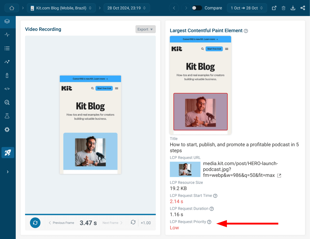
Currently, the tested pages where the LCP element is an image trigger DebugBear's Ensure LCP image is loaded with high priority warning. We also highlight this issue by indicating the low request priority below the LCP analysis, as it's something that's really easy to fix:
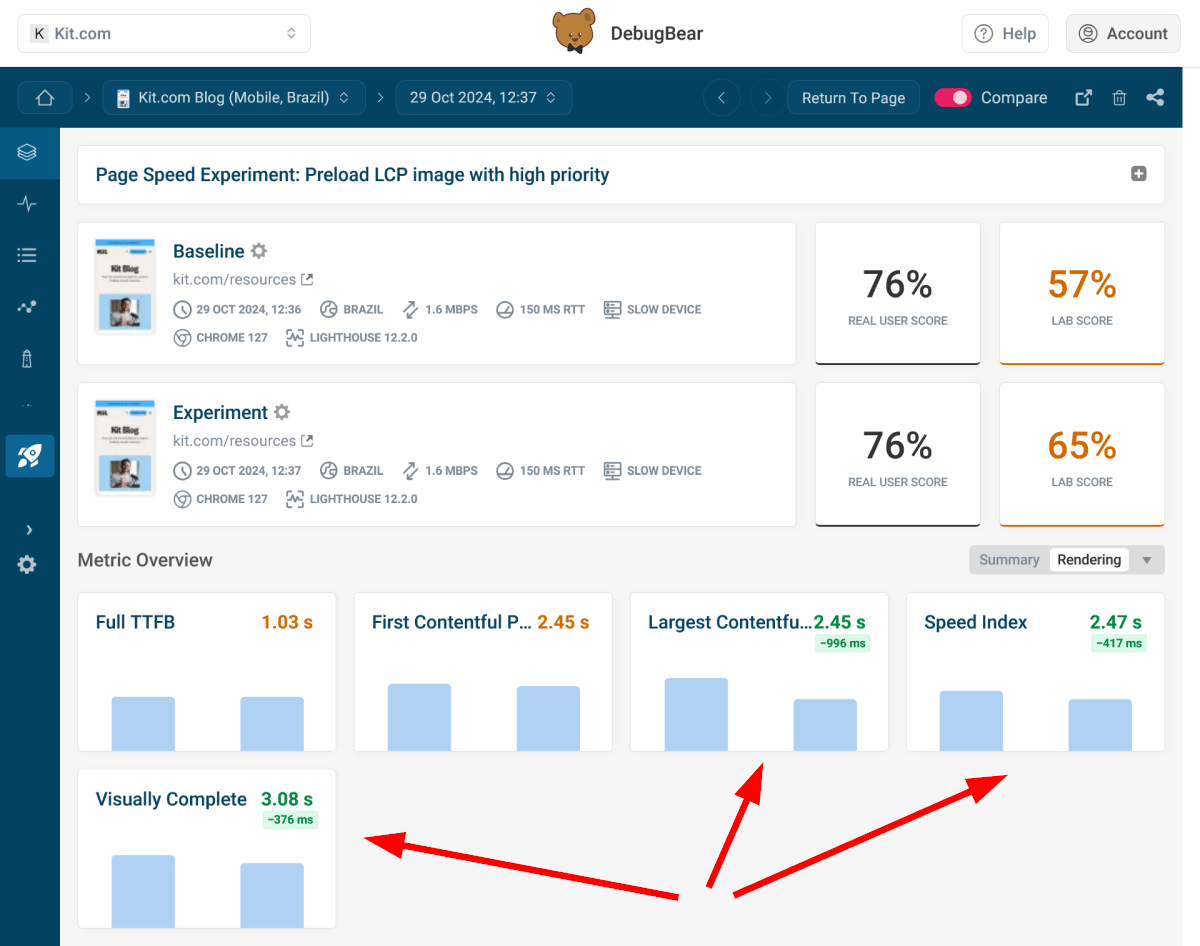
To evaluate the potential performance gains, we set up an auto-experiment that preloads the LCP image with the fetchpriority="high" attribute.
DebugBear provides auto-experiments for select recommendations, allowing you to test how they impact your web performance metrics. You can run the auto-experiments by clicking the Run Experiment button next to the recommendation. The results page shows a side-by-side comparison of your current code and the experiment to highlight the differences.
As you can see in the screenshot below, preloading the LCP image with high priority significantly improved the key rendering metrics, including Largest Contentful Paint, Speed Index, and Visually Complete:
Some of the LCP Images Are Lazy Loaded
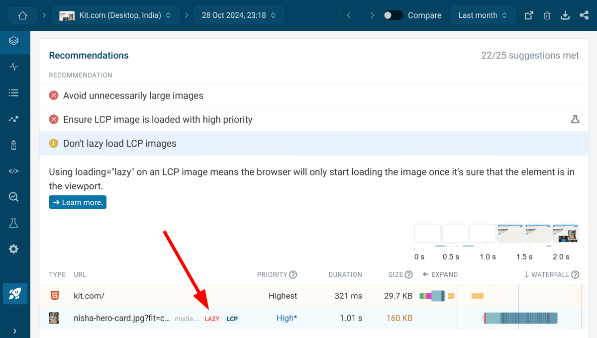
Lazy loaded LCP images are the last glitch we found on the tested pages, and it's the only one that made us really sad.
While we're hoping that this is a result of some auto-generated image syntax, possibly sent by the CDN provider, lazy loading LCP images is something that shouldn't happen on any website, as it harms both Largest Contentful Paint (obviously) and Cumulative Layout Shift (as unexpected layout shifts can occur if the image loads after the surrounding content):
The Verdict
Both our synthetic testing and the Chrome User Experience Report have shown that Kit's rebranding was largely a web performance success story, with consistently green Core Web Vitals scores, well-optimized resource hints and web fonts, and zero render blocking resources.
While we found a few glitches, the client-side issues are fairly easy to fix and longer Time To First Byte scores can be counteracted by optimizing other parts of resource loading (e.g. by loading or preloading the LCP image with high priority).
Want to see if we were right about the web performance implications of ConvertKit's rebranding? Run a free website speed test for Kit.com (or any other domain), or sign up for a 14-day free trial of our website performance monitoring service.
