Heatmap View: See Page Speed Correlations
The heatmap view in DebugBear's real user monitoring (RUM) solution allows you to see performance metrics broken down across two different variables.
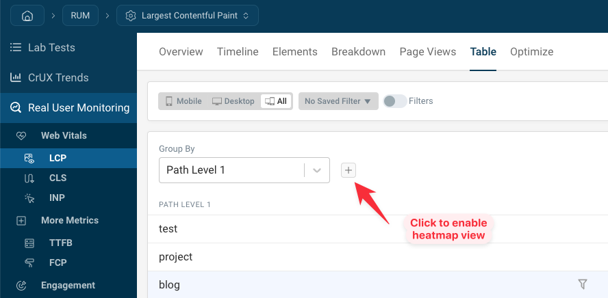
How to open the RUM heatmap view
Open any metric dashboard and select the Table tab. Click on the Plus Icon to add an additional property to group your data.
You can group data in the heatmap by any RUM metric or RUM property.
The heatmap shows a row for each data bucket for the first variable, in this case the first URL path level. Each column shows a bucket for the second variable, in this case the network round trip time reported by the browser.
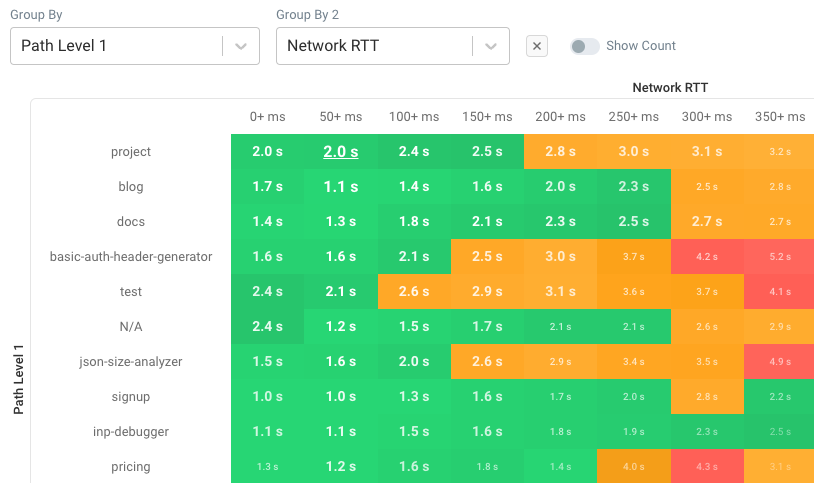
We can see that, in general, visitors with a slower network connection are getting worse LCP scores.
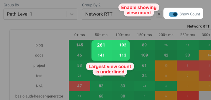
The size and opacity of the text indicates how many users are represented by each cell. Here we can see that the "project" path and 50+ ms of roundtrip time are most common, and users in experience bucket have a Largest Contentful Paint score of 2.0 seconds.
See view count per cell
To see how exactly how many views are covered by each cell, you can enable the Show Count toggle. Instead of showing the metric value, the heatmap now shows the number of page views.