CrUX Trends Dashboard
The CrUX trends dashboard provides a way to easily compare your website's Core Web Vitals to those of your competition.
CrUX data comes from Google's Chrome User Experience Report.
How to view CrUX trends
To view the CrUX Trends data on DebugBear, open your project dashboard and then select CrUX Trends in the sidebar.
By default it will show data for the website origins that you've set up lab-based monitoring for.
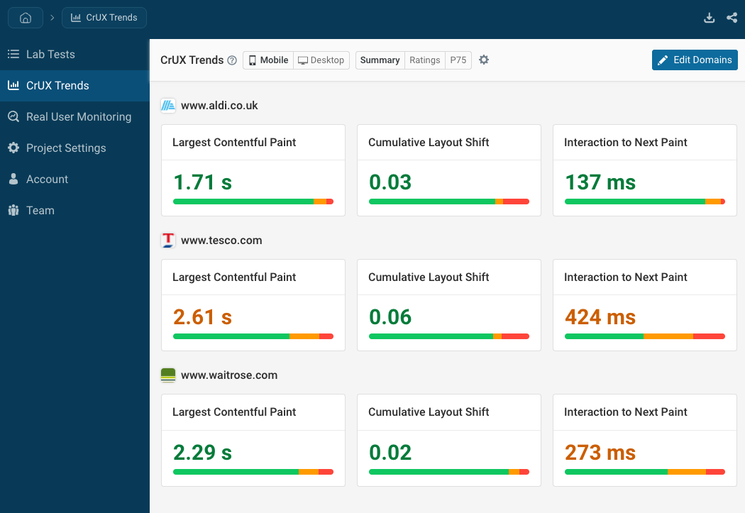
CrUX trends data covers origin-level measurements for the last 40 weeks. Each data point covers 28 days of data.
View URL-specific data
By default the CrUX trends dashboard shows data covering the website as a whole. Click "URL" in the top right to view data for specific page URLs instead.
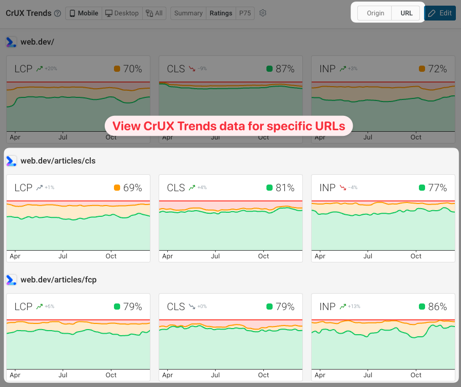
You may find that many of the URLs on your website don't get enough traffic to view URL-specific CrUX data. Consider collecting real-user monitoring data instead to get insight into user experiences on specific pages.
Summary view
The summary view shows two pieces of data for each domain:
- The most recent 75th percentile value
- The percentage of Good, Ok, and Poor visitor experiences
Ratings view
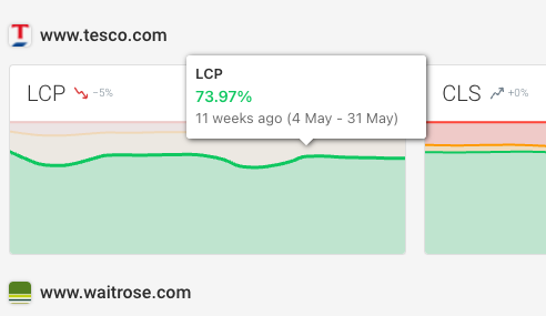
The ratings view shows Core Web Vitals ratings over time. Each chart shows the percentage of experiences that are rated as Good, Needs Improvement, or Poor.
The number in the top right shows the percentage of Good experiences.
You can hover over the chart to see over what period the data has been collected.
P75 view
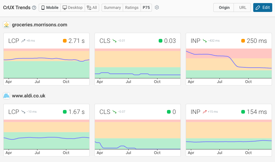
The P75 view shows the 75th percentile value for each metric. For example, an LCP value of 2.82 seconds means that 25% of visitors wait longer than that time.
Available metrics and data sorting
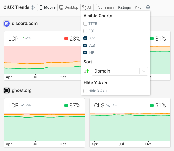
By default the dashboard shows the Core Web Vitals metrics. However, you can view data for any of these metrics:
- Time to First Byte (TTFB)
- First Contentful Paint (FCP)
- Largest Contentful Paint (LCP)
- Cumulative Layout Shift (CLS)
- Interaction to Next Paint (INP)
To configure what metrics are shown or to sort by a specific metric, click on the gear icon at the top of the page.
How to configure domains and URLs
By default, the list of domains and pages in the CrUX Trends view is based on the pages that you're running lab tests for. You can add new pages here, including for competitors.
However, you can also customize the list of website origins that the CrUX Trends dashboard shows data for by clicking Edit Domains.
Then you can either toggle domains from your lab tests or add a custom domain.
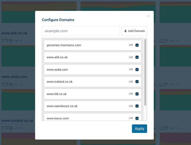
You can include up to 25 domains in the CrUX Trends dashboard.