Configure Device Settings for Synthetic Tests
You can customize the details of the devices used to test your site. For example, you can set up a device that closely resembles a typical customer.
Default devices
Four devices are configured by default.
The Mobile and Desktop devices match the settings used by Lighthouse and PageSpeed Insights. Note that there may still be differences in performance metrics in different environments.
| Name | Bandwidth | Round-trip time | CPU throttling |
|---|---|---|---|
| Mobile | 1.6 Mbps | 150ms | 4x |
| Mobile Fast | 12 Mbps | 70ms | 2x |
| Desktop | 8 Mbps | 40ms | 1x |
| Desktop Fast | 100 Mbps | 2ms | 1x |
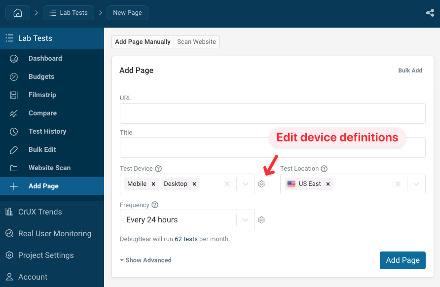
How to configure test devices
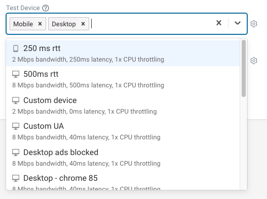
To modify the default devices, or create new ones, click on the gear icon next to the device dropdown when configuring a new page.
This will show the list of existing devices in your project.
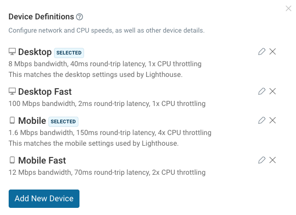
Click on the pencil icon to edit an existing device, or click Add New Device to create a new custom device configuration.
Configuration options
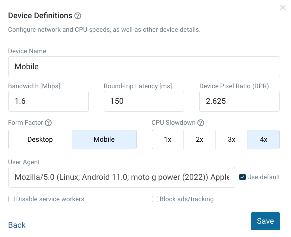
Bandwidth
The bandwidth setting limits how much data can be transferred per second. This determines how fast response data can be downloaded.
Round-trip latency
The round-trip time (RTT) measures how long it takes to send data to the website server and back.
RTT impacts server connection time as well as download duration.
When running a synthetic test, each network packet will be held back for this amount of time. DebugBear uses packet-level throttling to produce reliable page speed data.
Device Pixel Ratio (DPR)
This determines the display resolution of the screen. If you use responsive images on your website, the DPR setting will affect which image sizes are served.
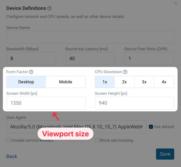
Form factor
This is either Mobile or Desktop. The form factor affects:
- screen size
- the user agent
- how the Lighthouse performance score is calculated (pages are expected to load faster on desktop than on mobile, so the same metrics will result in a different score)
| Form factor | Size |
|---|---|
| Mobile | 412x660px |
| Desktop | 1350x940px |
Screen size
The mobile and desktop devices each have a default screen size, but you can also set custom values for the width and height of the screen.
For example, you could set screen dimensions to match a tablet, or test mobile page views in landscape mode.
User Agent
Set a custom user agent header so you can identify DebugBear requests on your server.
CPU throttling
The CPU throttling option slows down code execution to simulate a device with a less powerful CPU.
Disable service workers
Don't register service workers. This can make it easier to test page performance if your service workers make a large number of requests to prefetch additional resources.
Block ads/tracking
This option installs uBlock Origin Lite on the test device.