Image Sizing: Intrinsic vs. Rendered Size
To serve properly sized images, it's important to understand the difference between intrinsic and rendered size.
In this article, we'll look into what intrinsic and rendered size mean, how mismatches between the two can harm the performance and aesthetics of a web page, how to serve properly sized images by matching intrinsic and rendered sizes, and how you can locate your unnecessarily large images.
The recommendations below can also help you fix the Properly size images audit in Lighthouse.
What Is Intrinsic Size?
Intrinsic size is the native width and height of an image or another media element (e.g. video or other embedded content) in pixels, as stored in the file. You can change the intrinsic size of an image by resizing and saving the file.
You can add the intrinsic size of an image in HTML using the width and height attributes of the <img> element:
<img src="image.png" alt="Image" width="900" height="600" />
This web performance best practice can reduce unexpected layout shifts on the page and, consequently, improve your CLS (Cumulative Layout Shift) results.
What Is Rendered Size?
Rendered size is the display width and height of an image or another media element in pixels as it appears on a web page after the browser has painted it to the screen.
It's defined by CSS sizing properties such as width, height, min-width, min-height, max-width, max-height, the dimensions of the viewport and the container element(s), and other factors.
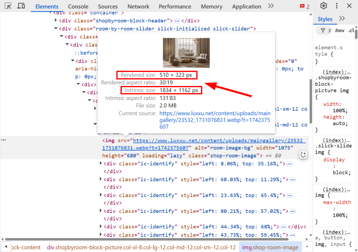
Find the Intrinsic vs. Rendered Image Size in Chrome DevTools
You can see both the intrinsic and rendered size of an image in Chrome DevTools by selecting the <img> element in the Elements panel and hovering your cursor over it:
Why Is a Mismatch Between Intrinsic and Rendered Sizes Problematic?
Ideally, the intrinsic and rendered size of an image should be equal at every viewport.
However, this is not possible in practice (unless you use SVGs — see below), as it would mean that you need to upload an infinite number of image files in different dimensions to your server.
What Happens When the Intrinsic Size Is Larger than the Rendered Size?
The page will download more data than necessary, as it still needs to download the intrinsic size before scaling the image down to render it to the screen. This may hurt page load times and some Web Vitals, such as FCP (First Contentful Paint) and LCP (Largest Contentful Paint).
What Happens When the Intrinsic Size Is Smaller than the Rendered Size?
If the browser renders an image in a size larger than its intrinsic size, it will appear blurred on the screen. This may hurt the aesthetics of the page.
3 Tips to Serve Properly Sized Images
To serve properly sized images, you should aim to keep the intrinsic size equal to or slightly larger than the rendered size. However, avoid serving images with intrinsic dimensions smaller than their rendered sizes to prevent blurring issues.
1. Implement Responsive Images
You can use responsive images to better match intrinsic and rendered sizes.
First, you need to upload your images in multiple dimensions to your server. Then, use the srcset and sizes attributes of the <img> element to inform the browser about the alternative image options. This allows the browser to select the best-fitting image file based on viewport size, layout, available space, and other factors.
You can use the responsive image syntax in HTML in the following way:
<img
  src="images/lake-lg.jpg"
  srcset="
    images/lake-sm.jpg  300w,
    images/lake-md.jpg  600w,
    images/lake-lg.jpg  900w,
    images/lake-xl.jpg 1200w
  "
  sizes="
    (max-width: 640px) 100vw,
    (max-width: 960px) 80vw,
    60vw
  "
  alt="Lake"
  style="aspect-ratio: 3 / 2;"
/>
The code snippet above defines:
- four image sources for the
<img>element in thesrcsetattribute, where the w-descriptors refer to the intrinsic widths of the alternative image sources in pixels (i.e., 300w refers to 300px, 600w refers to 600px, etc.) - three alternative layouts based on media conditions in the
sizesattribute
The default image file is also assigned to the required src attribute of <img>.
As you can see above, the responsive image syntax doesn't include the width and height HTML attributes that would normally define the intrinsic size of the image. This is because width and height override the srcset and sizes attributes, so the image could be rendered in unexpected dimensions.
However, it adds the aspect-ratio CSS attribute as an inline style rule to help the browser calculate the space needed for the image to prevent unexpected layout shifts.
To learn more about how the responsive image syntax works, check out our Ultimate Guide to Responsive Images on the Web.
2. Use an Image CDN
You can automate responsive image generation by using an image CDN (e.g., Cloudinary, Imgix, ImageKit, etc.), which prepares the source images and adds the responsive image syntax to the HTML.
Some image CDNs also provide integration plugins for popular website creation platforms, such as WordPress (e.g., Cloudinary and Optimole—the latter is a WordPress-specific image CDN).
WordPress implements basic responsive image syntax by default if you upload your images to the Media Library, which might be enough for a less image-heavy site.
3. Use SVGs
Since SVG (Scalable Vector Graphics) is a vector image format, its weight doesn't depend on its intrinsic size but on the complexity of the graphic. As a result, an SVG image scales to any size without quality loss. This makes it an excellent format for serving properly sized images on the web.
As it's a performance-friendly alternative to responsive images, consider replacing your raster images with SVGs wherever possible. SVGs are recommended for vector illustrations, line graphics, logos, icons, text-heavy images, and background patterns—check out our guide to image formats to learn more about when to use and when to avoid the SVG format.
Locate Your Oversized Images with DebugBear
The free DebugBear website speed test provides two ways to find unnecessarily large images on a page.
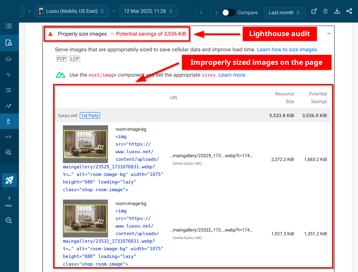
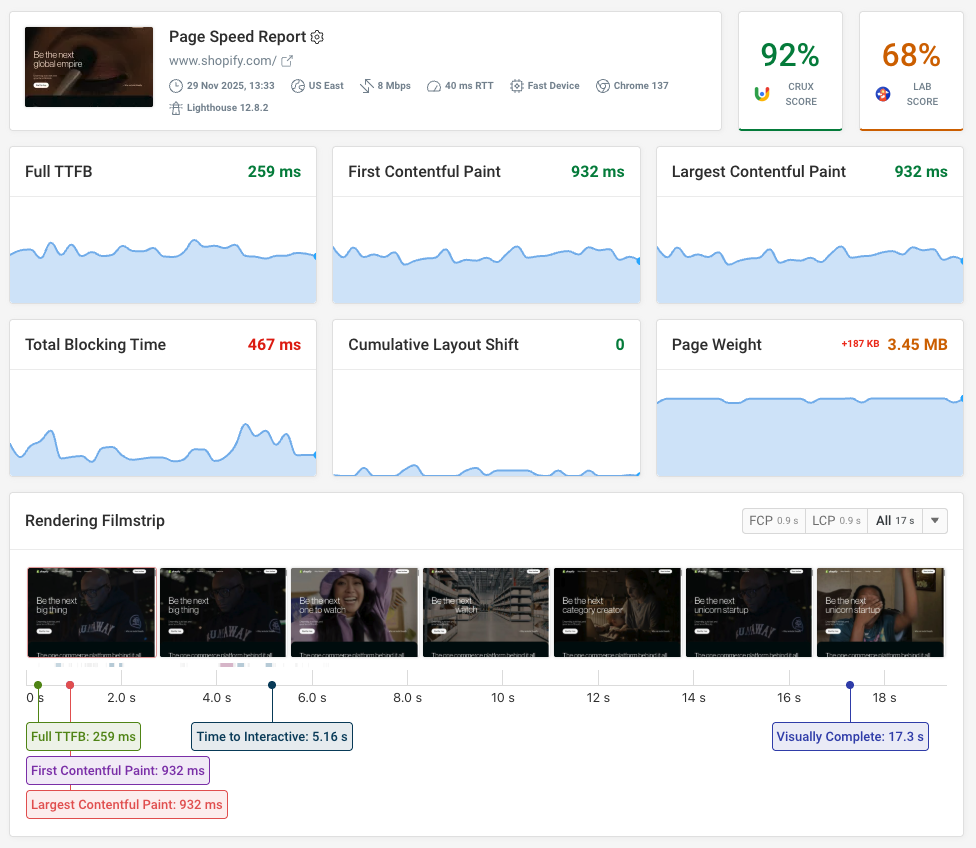
1. Check the 'Properly Size Images' Lighthouse Audit
The Properly size images Lighthouse audit shows a list of oversized images that failed the audit during the test run, along with the resource size and potential savings in kilobytes.
In the screenshot below, you can see the expanded Properly size images audit on DebugBear's Lighthouse page (accessible from the Lighthouse menu in the left sidebar):
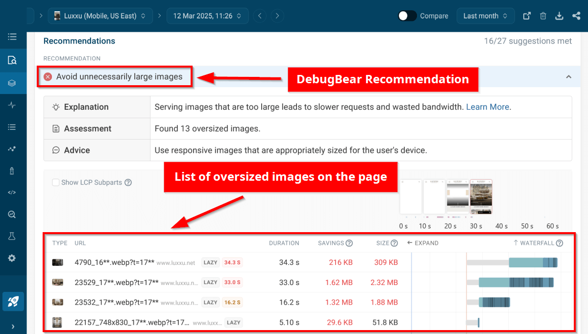
2. Check the 'Avoid Unnecessarily Large Images' DebugBear Recommendation
DebugBear's Avoid unnecessarily large images recommendation displays the total number of oversized images and a list of the images, along with their respective rendering duration, potential savings, file size, and a request waterfall.
You can sort the images based on duration, savings, and size, and expand the waterfall charts for more details.
In the screenshot below, you can see an expanded recommendation on the Overview page (accessible from the Overview menu in the left sidebar):
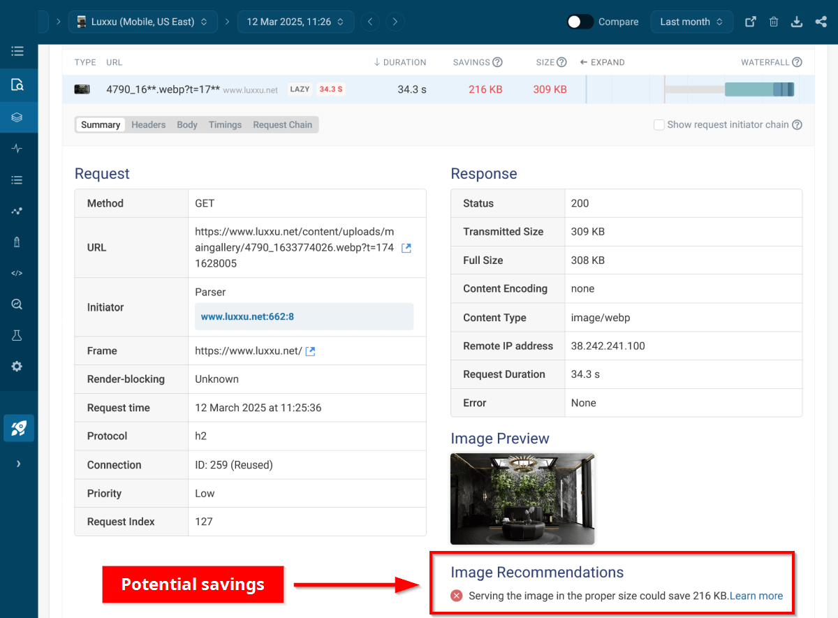
If you click an oversized image in the list, you can also see a detailed image file analysis, along with the potential savings in kilobytes:
Improve Image Performance by Matching Intrinsic and Rendered Sizes
By properly sizing images, you can reduce page weight, improve Largest Contentful Paint, and make your website faster.
Don't forget to check the Properly size images Lighthouse audit and Avoid unnecessarily large images DebugBear recommendation on both desktop and mobile, as there may be significant differences between the two.
Monitor page speed and image size
DebugBear synthetic website monitoring can track your page speed and alert you when there's a problem. For example, you can get an email or Slack notification when a new large image is introduced.
You also get in-depth recommendations to optimize your page speed that go beyond just images.
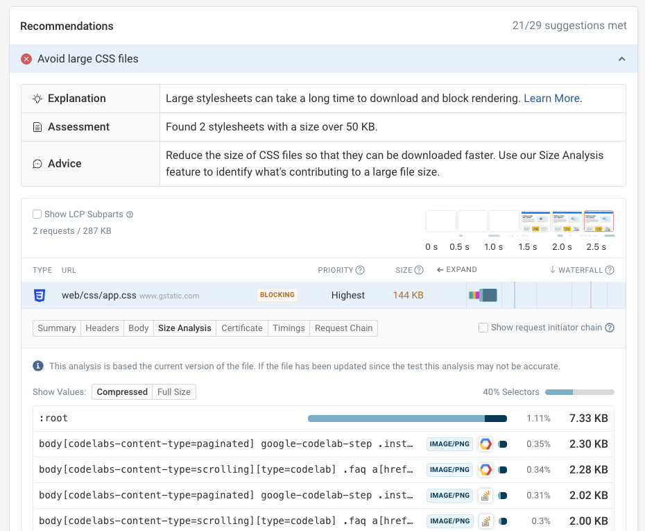
For example, DebugBear can help identify large CSS stylesheets and identify what components contribute the most to the overall size. Here we can see that many small images are embedded within the CSS code.
In addition to running lab tests, DebugBear can also monitor Google CrUX data and collect real user data from your actual visitors.
Start a free trial if you're looking for a comprehensive web performance monitoring solution.
Monitor Page Speed & Core Web Vitals
DebugBear monitoring includes:
- In-depth Page Speed Reports
- Automated Recommendations
- Real User Analytics Data