How To Fix Media Element Lacking An Explicit Size
When debugging Cumulative Layout Shift issues on your website you'll sometimes see a message saying that a media element is lacking an explicit size.
In this article we'll explain what this means and how to fix it.
Lighthouse testing and elements without an explicit size
Google Lighthouse is the tool behind PageSpeed Insights and the DebugBear speed test.
When running a Lighthouse test you can see missing explicit media size listed as a CLS cause under the "Avoid large layout shifts" audit.
Here's an example of that happening on a website.
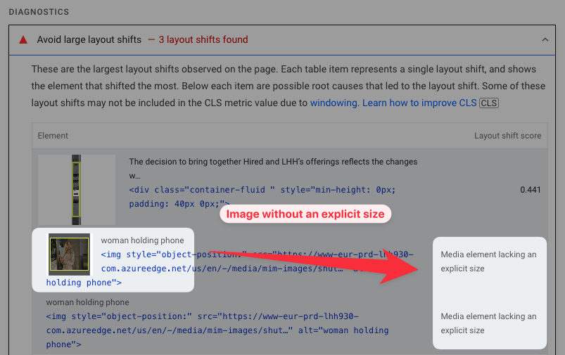
How lacking an explicit size causes layout shift
If an image doesn't have an explicit size then the browser will not allocate any space to it when first rendering a website.
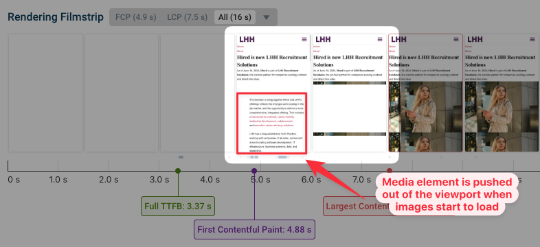
When the image then starts to load, the browser finds out how large the image is and expands the space that's taken up by the image element. That means any content below the image will shift down on the page.
Here you can see text shifting out of the viewport, causing a poor experience for any visitors who've already started to read the content.
How to set an explicit size for media elements
To fix this type of layout shift you can add width and height attributes to images on your website.
First you need to find out how large the element is when it's rendered on the page. One way to do that is using the Elements inspector in Chrome DevTools.
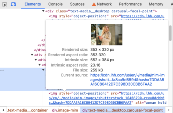
Based on this we now see that the image is rendered at a size of 353x320 pixels, and we need to add these attributes to the img tag on the page:
<img width="353" height="320" />
We can try this out using the experiments feature in DebugBear. In the Experiments tab, click on Manually edit HTML and then apply the necessary changes.
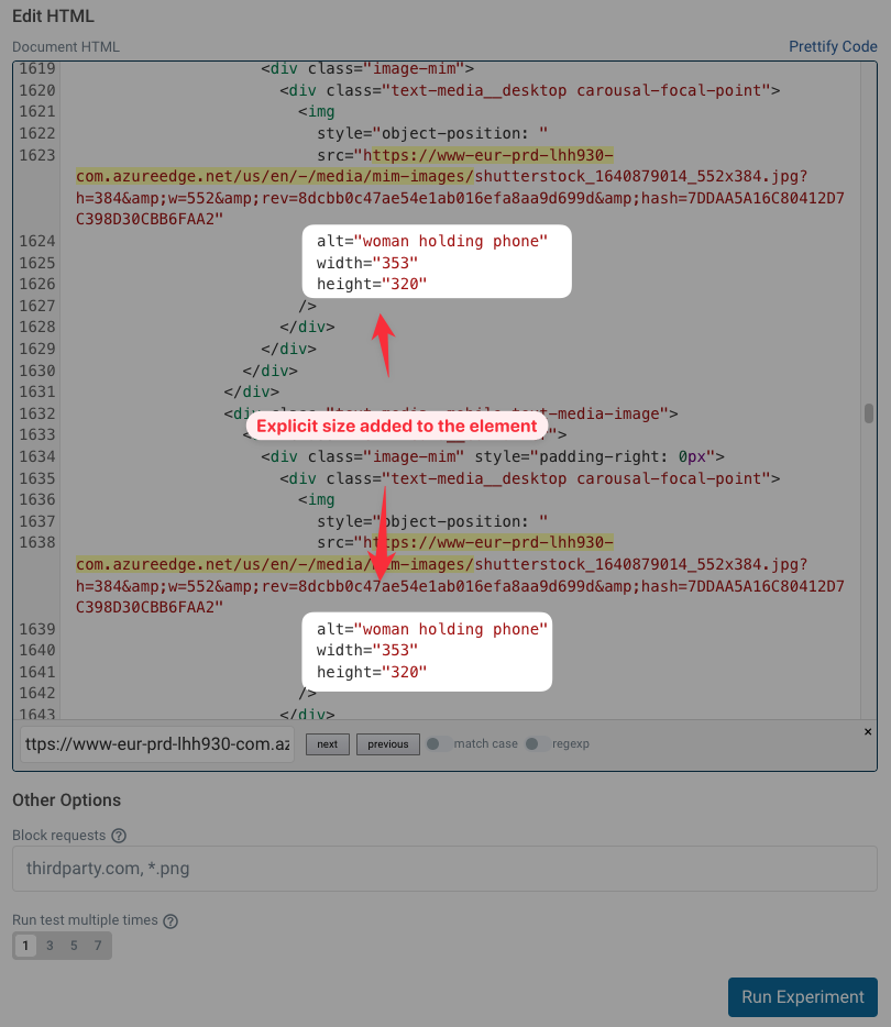
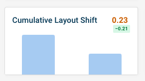
The result shows us that specifying the size has reduced the Cumulative Layout Shift score from 0.44 to 0.21. There are still other CLS issues on the website, but we've at least cut the score in half!
Using the width and height attributes won't always work well across devices. You can also use CSS styles to support media queries that can adjust the allocated space based on device size.
You can also use the aspect-ratio CSS property for automatic sizing based on the element width.
What counts as a media element?
There are three types of elements considered for the unsized media layout shift cause:
imgtagsvideotags- Elements with background images
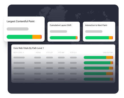
Tracking layout shifts on your website
If you want to fix layout shifts on your site you can use DebugBear to identify layout shifts, try out fixes, and track CLS and other Core Web Vitals over time.
Layout shifts often happen after a user interaction, which is why DebugBear can track CLS with real user monitoring on top of running synthetic tests.
You can also benchmark your website performance to see how you compare to other players in your industry.
Web vitals are an SEO ranking signal, so improving your visitor experience can also help you get more organic traffic.
Monitor Page Speed & Core Web Vitals
DebugBear monitoring includes:
- In-depth Page Speed Reports
- Automated Recommendations
- Real User Analytics Data