Fix Image Elements Do Not Have Explicit Width And Height
Ensuring images have an explicit size is a common Google recommendation to improve your Core Web Vitals. This article explains why that matters and what you can do to fix this issue.
Why should image elements have an explicit width and height?
To provide a good user experience, websites render progressively. Instead of only displaying content when the website is fully loaded, content is shown as soon as possible. As more content arrives this is inserted into the page.
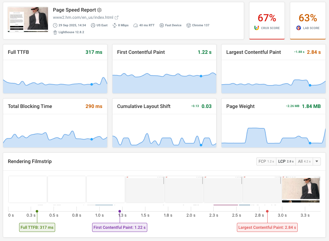
You can see that in this rendering filmstrip. The page starts out blank, then some text becomes visible. Finally, an image is shown.
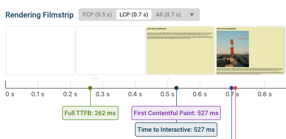
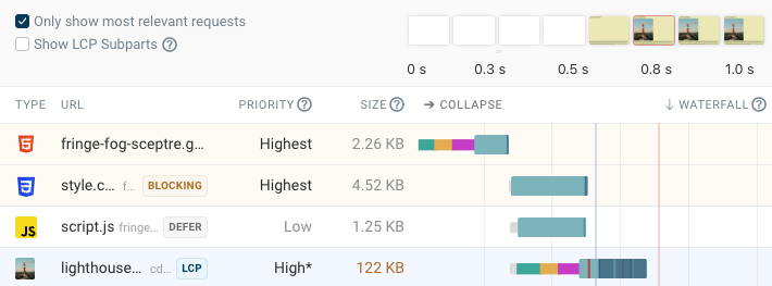
This correlates with how the browser loads different network resources. A request waterfall shows when different resource requests are made. Here we can see that page content becomes visible after the render-blocking CSS file has been loaded, and once the image is loaded it shows up as well.
Test your own website to see when different page resources load.
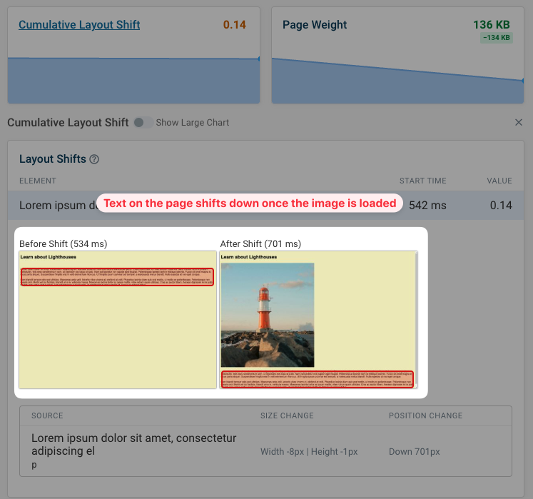
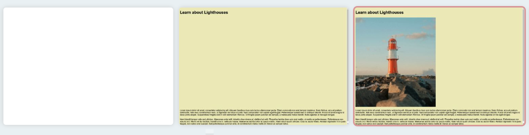
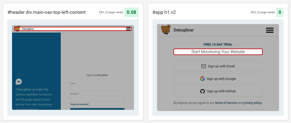
So what's the problem? Gradually showing content is good, but it can also cause layout shift on the page if no explicit image size is provided.
When the image loads it appears above the text of the page, and the text content shifts down. This causes a poor user experience, and increases the Cumulative Layout Shift (CLS) score of your page.
CLS is one of Google's Core Web Vitals metrics, so this can impact search result rankings.
Check your website with Lighthouse and PageSpeed Insights
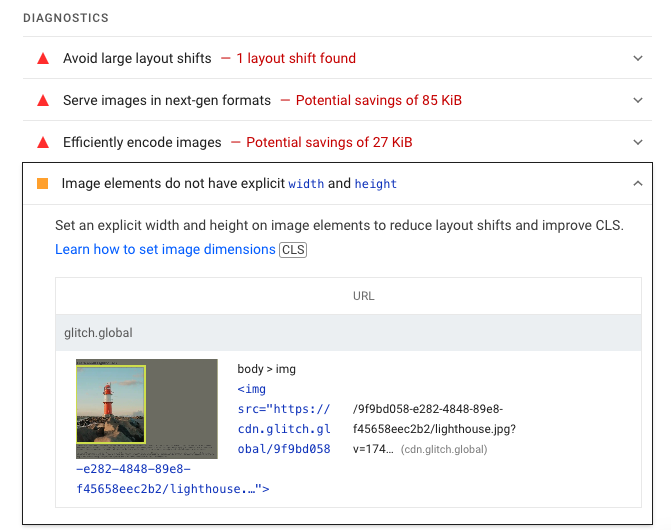
Google's Lighthouse performance tool has a built-in audit to detect when images don't have an explicit width and height. Lighthouse powers a bunch of performance tools, including PageSpeed Insights. If you want to check your website quickly, PageSpeed Insights is a great option.
If you scroll through the Performance section of the Lighthouse report you can find a number of diagnostic audits, including the "Image elements do not have an explicit width and height" audit.
This audit identifies images on the page where the browser doesn't know the size upfront, so they are liable to causing layout shift.
How to fix images without explicit width and height?
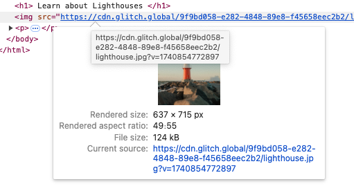
If you know the exact size of the image then you can use the width and height HTML attributes.
<img
  src="https://cdn.glitch.global/.../lighthouse.jpg"
  width="637"
  height="715"
/>
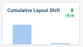
We can try this out with DebugBear experiments. If we edit the HTML accordingly we can reduce our CLS score by 0.14, eliminating CLS entirely.
Now, even before the image is loaded, the browser knows how much space it will need.
The user experience is improved significantly, as visitors won't be confused by content moving around after they've started reading.
Using the CSS aspect-ratio property
Responsive images won't always be the same size, so you can use the CSS aspect-ratio property to provide an explicit size without providing an exact value.
Inspect the element in Chrome DevTools and hover over the image URL to find the aspect ratio.
Then specify it in CSS. You'll also need to specify either a width or height, but you can usually do this based on the container size. Often the image will expand to fill the full width of the container (100%).
img {
  aspect-ratio: 49 / 55;
  width: 100%;
  max-width: 500px;
}
If you have poor CLS on your website, we have specific guides to fixing CLS issues and avoiding large layout shifts.
What elements are reported by the unsized images audit
Lighthouse aims to only report images that could cause layout shift. That means it checks:
- If there are
widthorheightelement attributes - If a size or aspect ratio is defined using CSS
- If the image is visible and has a size greater than 0
- If the image is embedded or loaded over the network
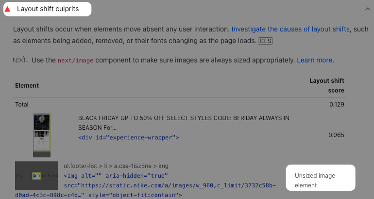
Unsized image element layout shift culprit
The Layout Shift Culprits insights audit also highlights image elements where no specific size is defined.
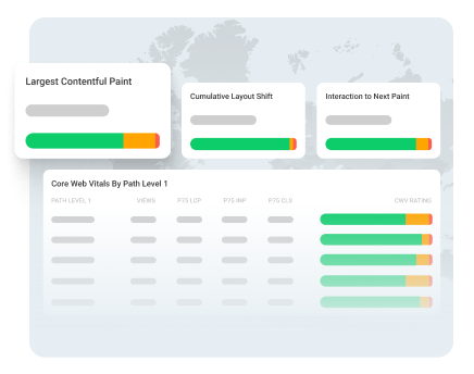
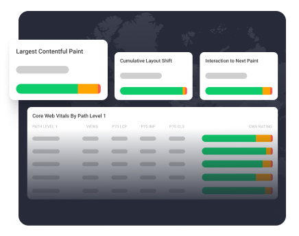
Monitor Cumulative Layout Shift on your website
Try DebugBear website performance monitoring to check CLS scores on your website and get alerts if they get worse.
When there's regression you can compare results before and after to see what caused the performance problem.
In addition to synthetic testing, DebugBear also checks the real user data from Google's Chrome User Experience Report (CrUX). This is what Google uses for rankings.
Track different pages on your website over time, or compare yourself to your competition. You can start a free trial here.
Identify hard-to-replicate layout shifts
Unfortunately, not all layout shifts can be identified with lab-based tests. Some CLS issues only happen following a user interaction, like scrolling down the page or filling out a form.
That's where real-user-monitoring is useful. You can find what elements shift around for real users, how often this happens, and what series of interactions leads up to it.
Monitor Page Speed & Core Web Vitals
DebugBear monitoring includes:
- In-depth Page Speed Reports
- Automated Recommendations
- Real User Analytics Data