Simulate A Mobile Device With Chrome's Developer Tools
The device toolbar in Chrome DevTools allows you to test responsive designs while working on a desktop computer. You can also test touch interactions and load pages with a custom user agent.
Read this article to learn how to enable device simulation in Chrome and what you can do with it.
What is device mode in Google Chrome?
The device mode feature in Chrome's developer tools allows you to load a website from your device as if it was accessed from another device. For example, Chrome can simulate:
- The viewport width and height
- The user agent sent by the browser
- Touch interactions
This functionality makes it a lot easier to test mobile websites during development.
How to enable device simulation in Chrome DevTools
Follow these steps to open the device toolbar and enable device mode:
- Right-click on the page
- Select Inspect in the dropdown
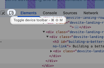
- Click the device icon to the left of the Elements tab
You can now view the mobile version of the website you're on as if you were using a phone to access it.
Apple's Safari browser also offers a responsive design mode that you can use to debug mobile websites.
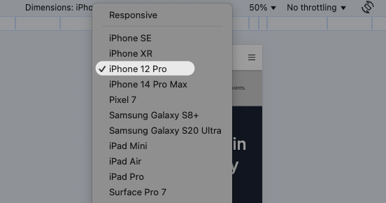
Selecting a specific device in the toolbar
Open the dimensions dropdown to enable emulation for a specific device.
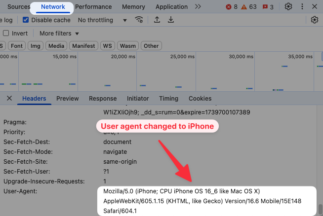
After selecting a device, you'll see that Chrome now sends a different user agent, in this case telling the server that the website is being accessed by an iPhone. You can view this in the DevTools Network tab.
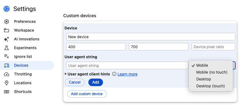
Configuring custom devices
Device simulation in Chrome DevTools also lets you specify custom device types with a specific viewport size and user agent. You can also enable or disable touch interactions or specify a screen resolution with the devicePixelRatio value.
To edit devices, open the Dimensions dropdown and select Edit.
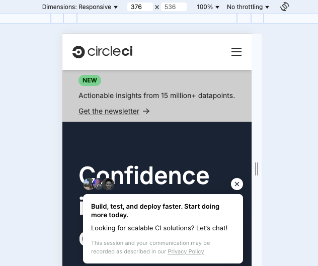
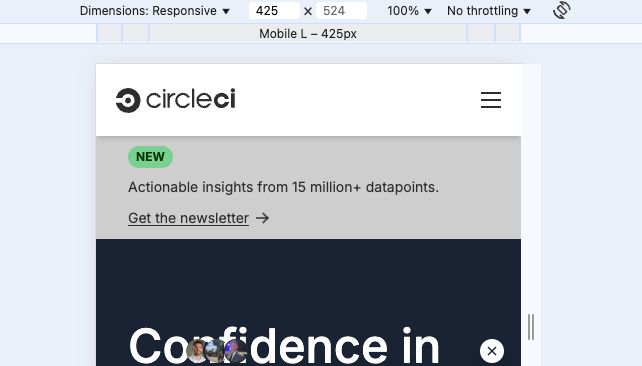
Using the responsive viewport setting
With the Responsive mode enabled in the Dimensions selector you can drag the sides of the rendered viewport to change the width or height of the test device.
Chrome also shows a number of default viewport widths like "Mobile L" at the top of the screen. Click one to set the width of the viewport to the selected value.
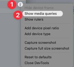
View media queries on your website
To view what CSS media queries are configured on your website, click the three dots on the right of the device toolbar and then select Show media queries.
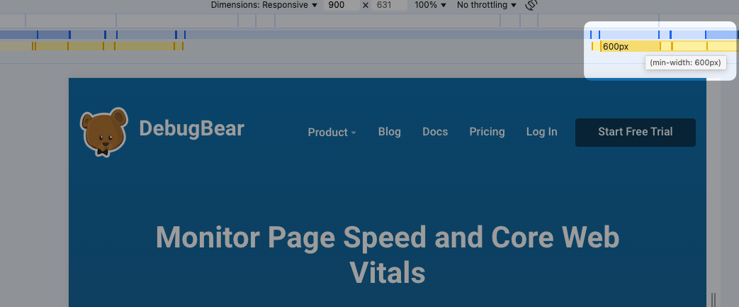
Chrome will then start showing what viewport width breakpoints are defined by your website's stylesheets, including the conditions they apply to, like a min-width value.
Click on a media query to resize your device to match the breakpoint width.
Limitations of Chrome device emulation
Chrome's device mode adjusts some high-level properties of the device that's used to load the website. But fundamentally you're still loading the page in Chrome on a desktop device.
For example, if you emulate an iPad, where Safari normally uses a WebView to display content, you'll still get the same browser features and behaviors of Chrome. If Safari does not support a feature that's used on your website, testing on the simulated device won't let you find out.
If you want more reliable data, test on a real device and connect the DevTools with remote debugging.
Test page speed on your mobile website
Use our free website speed test to measure page load time on your website. In addition to adjusting the viewport size we also simulate a slower CPU and throttle the network.
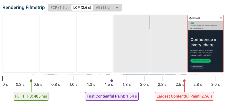
The test results provide a detailed breakdown of what resources are loading on your website and how long they take to load. You can then use this information to optimize your website performance.
For example, you can see what network requests are made in the request waterfall visualization. When different resources load determines how quickly content starts showing up on your page.

Monitor web performance over time
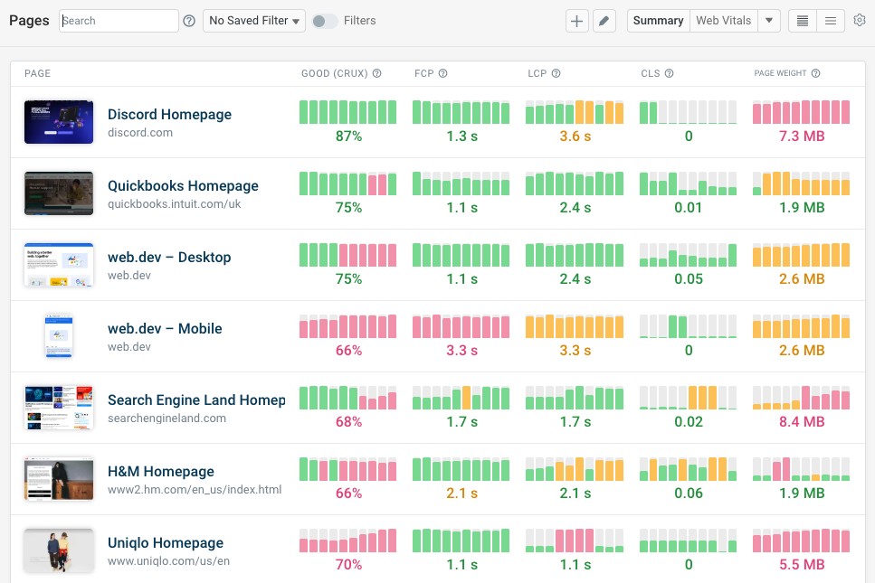
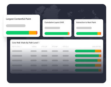
A website performance monitoring service like DebugBear can help you keep your website fast in the long term. Our product combines scheduled synthetic tests with real user analytics to give you comprehensive insight into your page speed.
Run regular performance tests to see trends and get alerted to regressions. Dive into our detailed reports to get the technical insights you need to fix poor website speed.
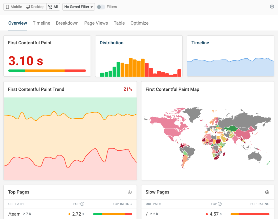
Our real user analytics tell you how fast your website is for actual visitors. Break visitor experience down into different segments and identify how often different aspects of your website result in slow load times or slow user interactions.
Review specific page views to understand exactly why your website loaded slowly and what you need to do to fix the issue.
Monitor Page Speed & Core Web Vitals
DebugBear monitoring includes:
- In-depth Page Speed Reports
- Automated Recommendations
- Real User Analytics Data